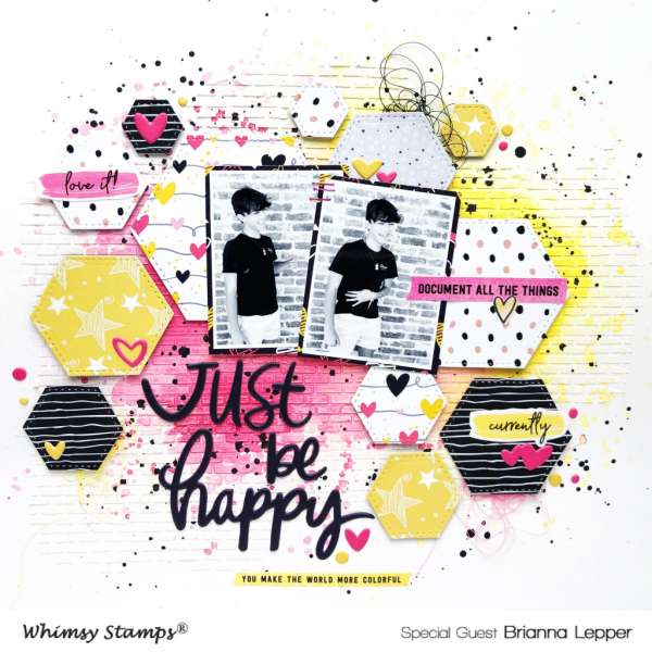
This layout from Brianna has lots of depth and texture. Her background is a brick pattern stencil, the white on white is subtle around the edges but really pops with the bright pink and yellow color and splatters over top in the center. She popped the hexagon shapes up off the page adding some string and dimensional stickers and title for even more dimension.
Visit the Whimsy Stamps blog for more info.
-Heather



Leave a Reply