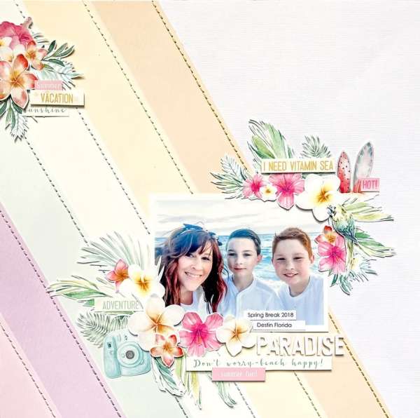
Allison cut strips of pastel cardstock and added them at an angle on part of her wonderful Tropical Paradise layout. She also stitched down the edges for added interest and texture. Take a closer look at the Allison Davis blog.
Stuck for ideas for your layout backgrounds? Try going back to the basics. Stripes are a simple way to add color and pattern to your pages and sometimes they can also be not so simple too, use what works best for your design and subject matter. To create stripes you can use strips cut from cardstock, stenciling, inking, use embellishments like ribbon or just simply use striped pattern paper. Let’s take a look at loads of different ways to add some fun stripes to your scrapbook layouts.
Beneath each photo you’ll find a link, click it for more info like products used, tips and tutorials.
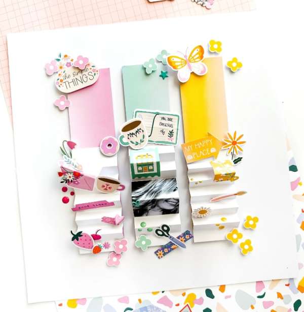
This amazing layout from Kerstin has three wide strips of colored paper with dimensional accordion folds in white to pop up the photo and and all the fun little embellishments. Notice how the embellishments are the same color as their base stripe. Learn more about this unique layout idea at the Pinkfresh Studio blog.
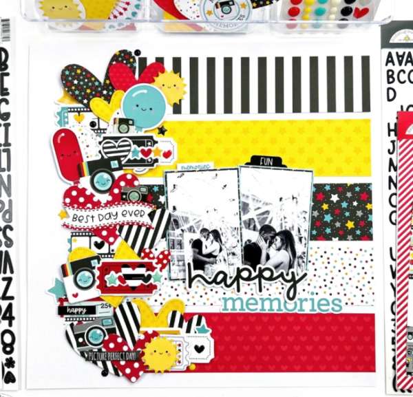
Erica used 5 different pattern papers to create the stripes on her theme park layout. She also created a wide horizontal border stuffed full of different printed dies and die cut hearts all in patterns and colors that coordinate together. She kept the photos black and white to stand out against all the patterns. Take a closer look at the Doodlebug blog.
I’m in love with the mix of pattern papers Dorymar used on her layout, including of course some stripes. Stripes really mix well with other patterns, just keep your color scheme cohesive, try mixing and matching some pattern yourself, it’s fun! This page also has some hidden photos. Take a look over at the Simple Stories blog.
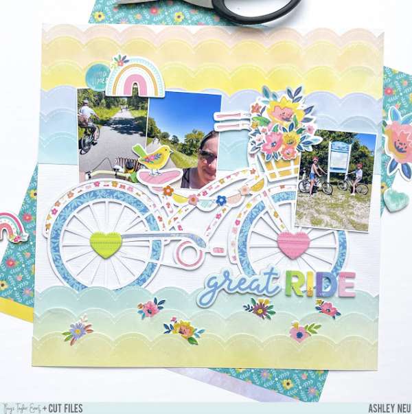
Add some extra interest to your stipes with fun edges like scallops. For her bike riding layout Ashley fussy cut scallops from pattern paper but you could get this same look from die cutting, punching or using decorative scissors with scalloped edges. Find more details at the Paige Taylor Evans blog.
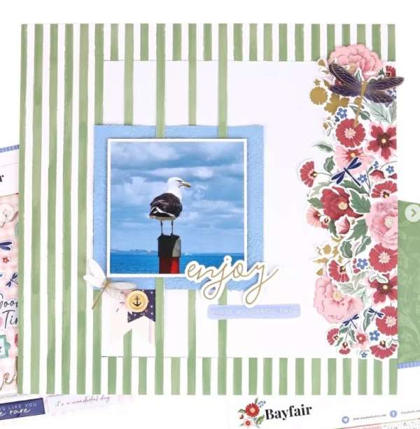
This clever striped layout uses striped green and white pattern paper but has some cuts made along a few of the stripes to weave in a layer of white cardstock and blue matt behind the photo. A wide horizontal border of flowers balances out the stripes beautifully. I came across this idea on the Rosie’s Studio Instagram page.
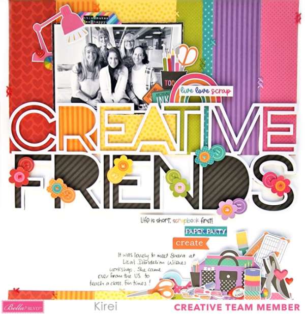
Kirei lined up her pattern paper strips to be the same with as each letter in the die cut word “creative” for this fun and colorful layout. Notice how to bottom word “friends” in the title is backed in black, it helps both words really pop! Learn more at the Bella Blvd. blog.
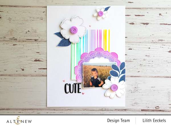
Lilith create her own custom stripes using a stencil and pretty pastel ink pads. She also stenciled the doily in the same colors, pulling the purple out on the button centers for her stamped flowers. Find directions over on the Altenew blog.
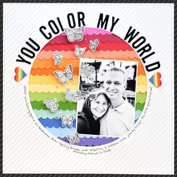
I love this bright rainbow of stripes Suzanna created using a scalloped edge die. She placed them in rows behind a large circle die cut from the center of the layout, which has a subtle diagonal stripe too. She kept most everything else like the photo, die cut tile and stamped butterflies in black and white to let the colors stand out. Take a closer look at the Spellbinders blog.
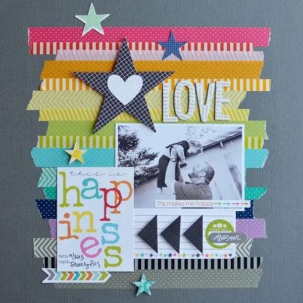
Grab a bunch of rolls of washi tape and design yourself a beautiful background like this sweet page from Linda. She tore the edges of the tape for some added texture and included some embellishments covered in washi tape too. Take a closer look at the Hub Pages blog.
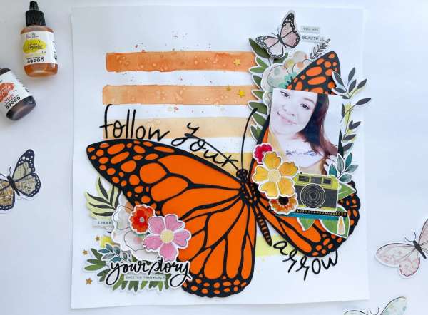
Neftali created rows of ombre’ stripes from orange to yellow using liquid watercolors. Adding some splatter over top created a pretty rustic background for the large butterfly die cut backed with orange cardstock. Watch her process video on the Cardstock Warehouse blog.
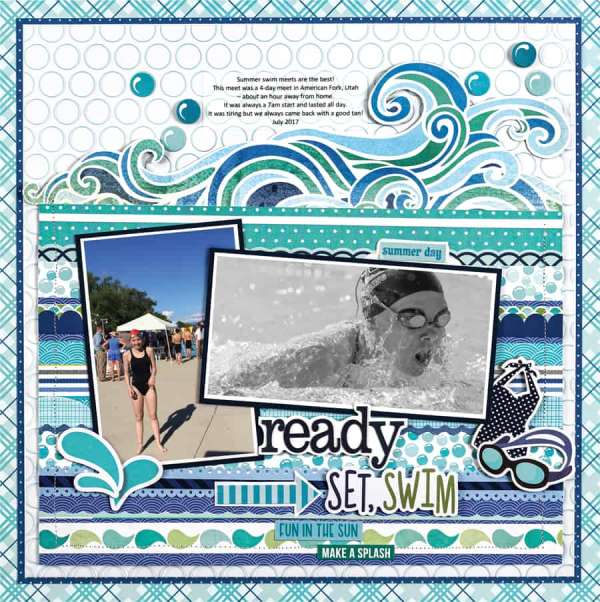
And lastly is this stunning swimming layout from Kerys. She used lots of stripes of different blue pattern papers stacked together and stitched around the edges. There’s lots of pattern going on here but keeping to the same colorand using tiny prints doesn’t overwhelm the design. I came across her idea on the Scrapbook and Cards Today gallery.
I hope you’ve found some inspiring ideas and will give stripes a try on your next scrapbook layout!
-Heather
You can shop some of the affiliate companies mentioned in this post:


Leave a Reply