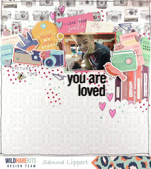
Sanna has an amazing balance of “white space” on this “You are Loved” Layout. With a busy pattern paper, the photo, title and most of the embellishments concentrated at the top of her page and a more simple paper at the bottom, it adds so much interest. Having just a few elements trickle down into the bottom then adds movement to the page.
Visit the Paierstau blog for a closer peek.
-Heather




Leave a Reply