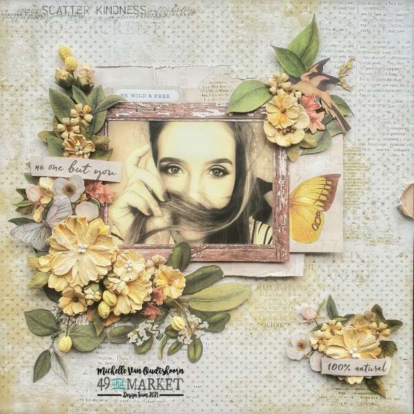
Michelle used muted yellows and greens along with off white for this beautiful vintage inspired floral layout. The sepia toned photo works perfectly with the layers of flowers, butterflies and botanicals. Subtle distressing of papers and 3D flowers add so much texture and depth to this design too.
Visit the 49th and Market blog for more info.
-Heather
Looking for more digital papers? Check these out over at Design bundle
Are you looking for more Embellishments, papers, and supplies? Check out today’s crafting deals over at Amazon.com.
Looking for more ideas? Follow our Pinterest Boards.


Leave a Reply