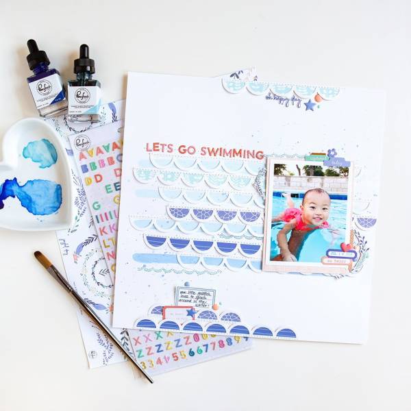
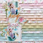
Blue pattern papers and washes of watercolor behind the rows of scallops on this layout from Jung are a clever way to represent waves on her swimming layout. I love how she stitched the scallops and title down to her page for added texture.
Visit the Pinkfresh Studio blog for a closer look.
-Heather
Leave a Reply