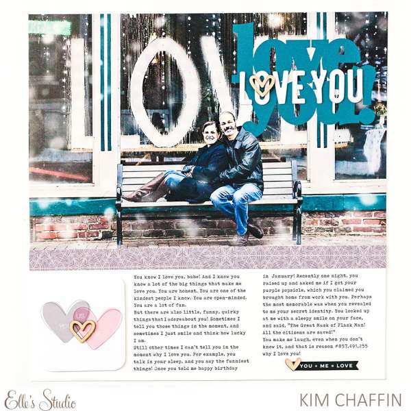
I love the layers of “love” that Kim added on her layout. The words on the window on the photo layered with two sets of die cut words finished of with a wooden heart adds loads of depth and dimension to her title. She still had plenty of room under the large photo for journaling and some extra embellishment to finish off the design.
Visit the Elle’s Studio blog for a closer look.
-Heather
Leave a Reply