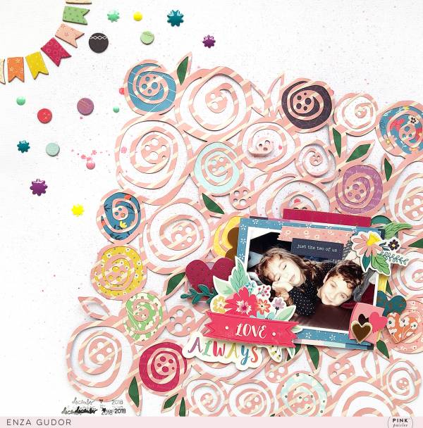
The lovely background on this layout from Enza has a geometric rose pattern and I love how she didn’t center it on her page but hung it off the edge and trimmed it off. She balanced this on her page by adding small accents and small banners to the other side. It’s the perfect frame for the sweet photo.
Visit the Pink Paislee blog for a closer look.
-Heather



Leave a Reply