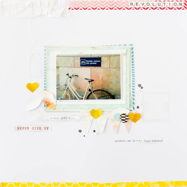
I love the loose stacked look of the pattern papers behind the photo on this layout from Janna Werner. It’s a great way to add some depth and texture. The scatter of small elements and text on the mostly white background give a nice clean look to this page.
You can take a closer look over on her blog.
-Heather




Leave a Reply