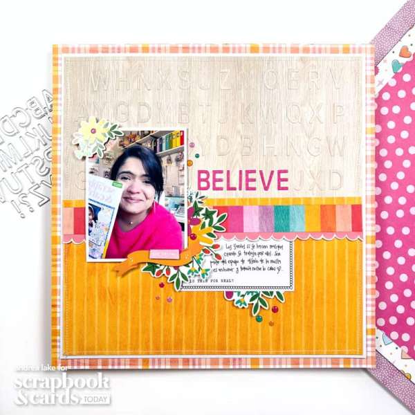
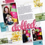
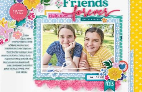
Andrea used die cut letters to fill the top half of her layout cut from the same backing paper for a subtle texture and design. Then she cut her title from bright pink cardstock so it really pops! Take a closer look at the Scrapbook and Cards Today blog.
If you’re struggling for title ideas for your next scrapbook layout sometimes it’s nice to go back to the basics like die cutting. Die cutting is a tried and true way to add titles, sentiments and sayings to your pages. Alphabet dies are perfect for when you want a custom title because you can spell out anything you’d like. You’ve got lots of choices with either metal or digital words and phrases you can manually or electronically die cut. Also with digital you can adjust the size for a large or small designs. Other ways to customize die cut titles is to cut from colored cardstocks, pattern papers or even other mediums like chipboard, cork or metallic papers to coordinate with your layout. So let’s get inspired and take a look at some scrapbook page ideas that have die cut titles.
Below each photo you’ll find a link, click it to learn more like products used, tips and tricks.
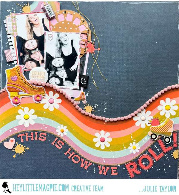
Another great thing about letter dies is you can “shape” them like Julie did here. She followed the scrolling edge of the pattern paper with her wonderful title. Notice how the “roll” was also stamped before die cutting to add extra emphasis. Learn more at the Hey Little Magpie blog.
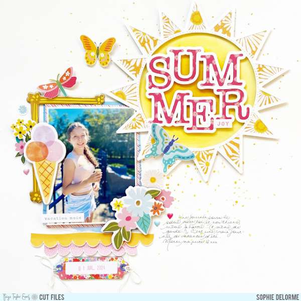 This beautiful “summer” die cut tile also includes a sun around it for a perfect focal point on a summertime layout. Sophie used it backed with yellow papers, offset from the photo. The layout also has clusters of borders, frames and chipboard embellishments with handwritten journaling. Find more info at the Paige Taylor Evans blog.
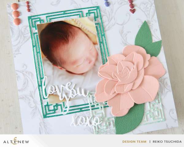
Mix your die cut titles with other dies like these sweet die cut words cut from white cardstock that are used along with intricate frames and a large flower die. Find all the details of Reiko’s darling baby layout at the Altenew blog.
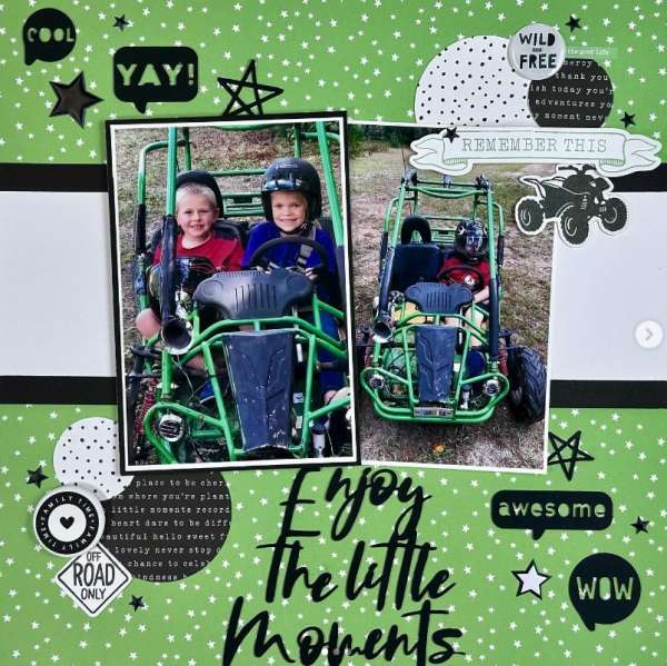
This awesome boys page has not only a die cut title but also several die cut word balloons with different words too. This black and green color scheme was pulled from the photos for a very balanced design. I came across this page on the sheshed_scrapper Instagram page.
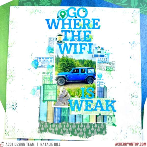
Natalie used a long title that practically fills the entire page. If you’re wanting to create a long title then letter dies are perfect because sometimes sticker letters might not have all you need. Here she layered her title over top lots of torn pattern papers and an inked and stamped background. Drive on over to The Cherry on Top blog for more info.
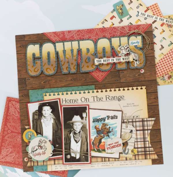
Marcia didn’t use pattern paper on her large die cut “COWBOY” title she used a stencil with Distress Oxide Inks and stencil paste to make her own pattern to take this title to the next level! I spotted her idea on the Echo Park Paper Instagram page.
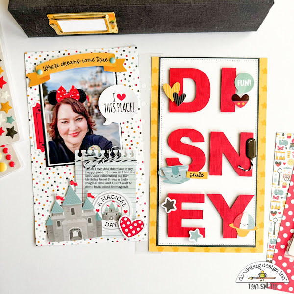
For her Disney themed tall Traveler’s Notebook album Tya spelled out “Disney” using die cut letter in red cardstock for one half of a double page spread. I love how she broke it down into 3 rows and added fun little embellishments around each letter. Pop on over to the Doodlebug blog for more details.
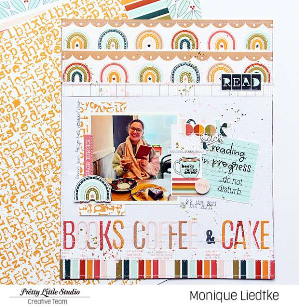
Die cutting your title from coordinating pattern papers will help tie it to the rest of the design on your layout like Monique did. I also love how she stitched her custom title letters down for some extra texture. Learn more at the Pretty Little Studio blog.
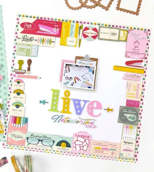
The cool Stitched Alphabet dies punch little holes in each letter so you can sew on them, how fun is that!? Angela used them on her layout that has a wonderful border all the way around made up of pre-printed die cut images. Take a closer look at the Spellbinders blog.
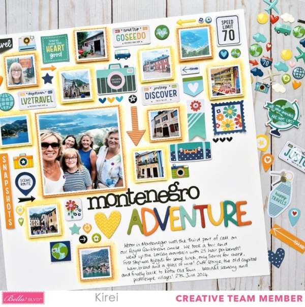
It’s fun to mix up the fonts on the same die cut title to add a little extra interest. Notice that Kirei also used different colors of cardstock on the second part of the title, this also adds even more uniqueness to her custom title on this awesome travel layout. I spotted her idea on her kirei65 Instagram page.
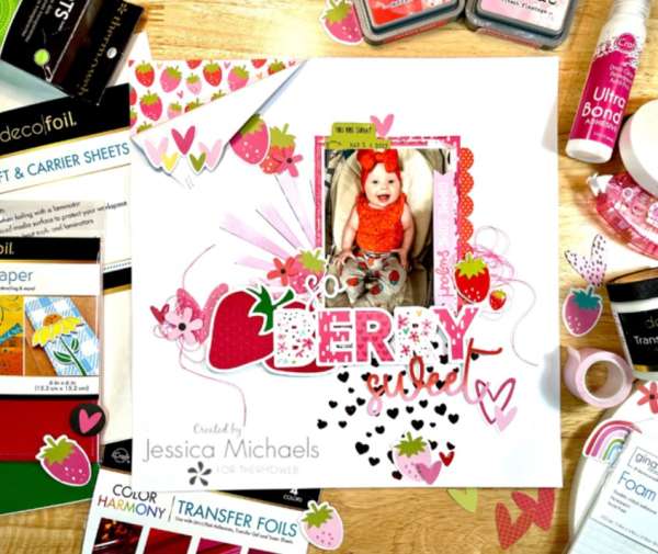
Jessica cut the strawberry and ” so berry sweet” die from white cardstock, backing the “berry” with pattern papers and adding color the the “sweet” with inks. There’s also stenciling and foiling on this wonderful mixed media layout. Watch her process video on the Therm O Web blog.
I hope you’ve gotten some great inspiration today to add some die cut titles to your next scrapbooking projects.
-Heather
You can shop some of our affiliate companies mentioned in this post:
Leave a Reply