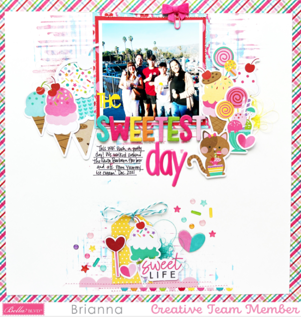
Brianna used a sketch as the jumping off point for this yummy Ice Cream Layout. With the photo top center she added the title and journaling underneath and surrounded the photo with die cut ice creams and candies. The larger cluster up top is balance by a smaller one at the bottom of the page, leaving some white space in the middle of the design. Twine, thread, puffy stickers and sewing add nice texture to this design too.
Visit the Bella Blvd. blog for more details and to get the sketch.
-Heather
Looking for paper crafting supplies? Check out Craft Stash


Leave a Reply