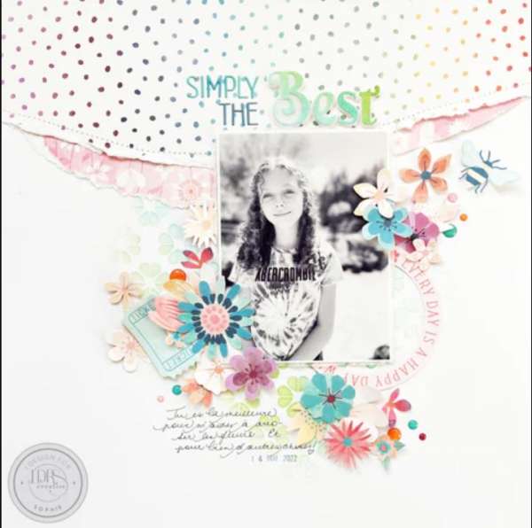
I love all the texture Sophie has on this lovely “Simply the Best” Layout! She used ink and a stencil to add color and pattern to her background, torn pattern paper creates a border across the top, she mixed puffy and die cut letters for the title and the black and white photo is surrounded by fussy cut flowers. Notice how much of the “action” is in the center of the design, this pulls the eye toward the photo.
Visit the LDRS blog for more info.
-Heather
Looking for paper crafting supplies? Check out Craft Stash


Leave a Reply