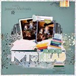
I have another digi scrapping program for you. It is called [tag]Scrapbook Max![/tag] and I must tell you it is very simple to use.
If you are looking for a very straight forward program, this is for you. All your options are laid out for you in a very efficient way. They even have books already put together that you just insert your pictures into. (Note: I think the other programs specifically focused on [tag]digital scrapbooking[/tag] also include this option.)
The only thing I have to say that would be a negative to this program is that it is very simple. If you are more than a beginner or someone who likes to keep it simple, this is not the program for you. There are not a lot of options. You are not going to be able to do a lot of custom work with this program.
I would definitely recommend this program for a beginner or someone who wants to keep it simple. I liked the program. It seemed to be worth the price. If you have used this program or have an opinion, let me know.

Hi there — listen, I hope this doesn’t come across as rude. I’d just like to make a plea here for the poor reader. I work professionally in page layout, in educational publishing, which is why I am posting this. I would really *like* to read your posts here. But there are very hard to read. They are all different colors. Some are centered, some are right flush. Some of them [like the organizational entry I tried to read] the leading is all off.
These kinds of funky type effects are lots of fun and can work great if it is just a line or two of text — titles, captions, words used as design elements, etc. But when you are writing multiple paragraphs intended to convey actual information…. it makes it visually exhausting for the reader to try and read, and it seriously impacts reading comprehension [like I said above…educational publishing]. So eyes can skim over the information but comprehending or retaining any of the content is not going to happen.
I made my way here from one of the other topics on this site. They are all interesting and well written. I would really like to read yours too, since I am very active in scrapbooking [just had an article published in a national magazine, yay]. Like I said, I don’t mean to be rude or critical. Just wanted to make my case to PLEASE consider posting in a plain old, easily readable, black font with standard leading and formatting, and why it’s a good idea.
Digitasl scrapping sure is taking off right now. I heard that either Simple or CK, whichever one was doing the special issues on CGS [I want to say Simple, but I could be wrong] has now turned it into a regular, new, monthly [maybe bi-monthly] magazine to meet demand. I do a small version of it myself, making pdf newsletters with photos to share with family via email…. but since I do it at work all day long it is more work than fun for me. I like getitng off my computer, but that’s just me. 🙂
Have a great one.
Michelle,
Thank you so much for letting me know. The different colors and fonts do not both me, so I have never even thought of it being an issue. Obviously I want people to read my blog and your advice is very welcome. I have changed the last few blogs and will continue in a normal text. I hope you will come back and enjoy more of my posts.
Jessica