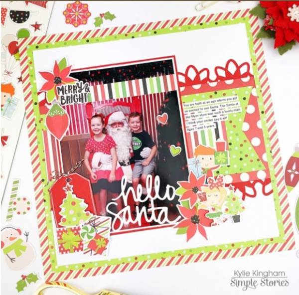
The traditional red and green colors and all the different patterns on this Santa page from Kylie really stand out against her white background. As does the white title she added over the photo. And I like how she used lots of accents to balance out her large photo.
Visit the Simple Stories blog for a closer look.
-Heather
Looking for Simple Stories Supplies? Check these out at Scrapbook.com


Leave a Reply