Michaels, North America’s largest arts and crafts specialty retailer, launched its first ever “Handmade Holiday Contest” on November 1, and will be awarding two $100 gift cards awarded every week through December 20. Customers can upload photos of their handmade gifts at Michaels.com, and website visitors can rate their favorite entries online. Two grand prize winners will be selected – one grand prize winner for “Best Creative Project” and one grand prize winner for “Best Creative Project under $20”. Each grand prize winner will get a $250 gift card and a trip for two to New York City to see The Martha Stewart Show. Visit http://www.michaelscontest.com/details for more information.
Comments
Trackbacks
[…] more here: Michaels’ Handmade Holiday Contest AKPC_IDS += "10433,";Popularity: unranked […]
Have you read?
Crafty Themed Mini Scrapbook Album
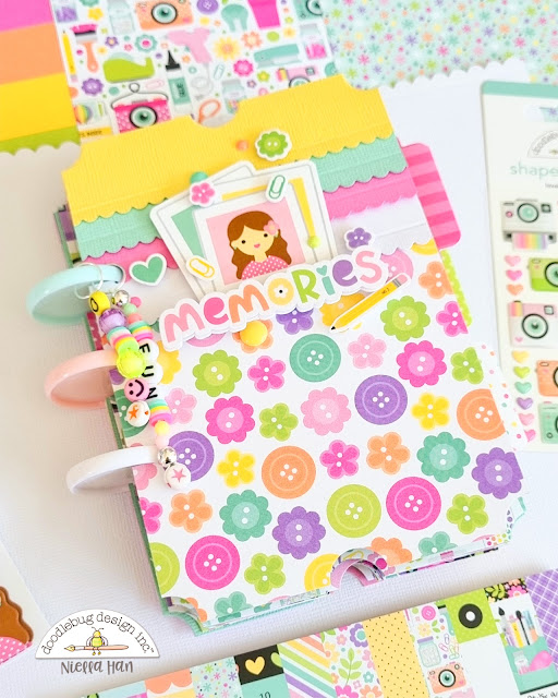
Niella used the Color Me Crafty collection from Doodlebug to create this adorable crafty themed mini album. The cover and each page are shaped like giant tickets and there’s a disc binding on the edges and fun dangling charm hanging on the spine. The cover has a cute stack of Polaroids accent and a layered scalloped border with button pattern paper.
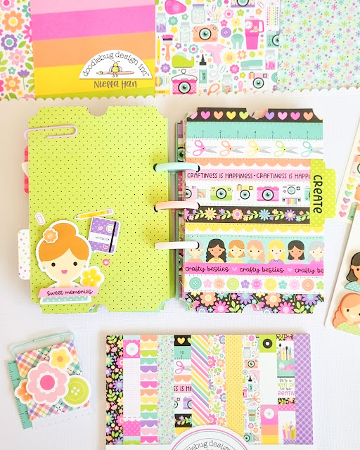 Inside she used more crafty pattern papers, embellishments, stickers, cardstock, puffy words and more to designs wonderful pages that have lots of room for crafty photos and journaling.
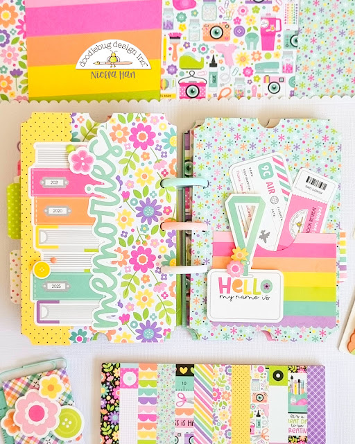 There’s even a pocket to tuck in mementos and ephemera. I love the color scheme of this collection, it’s so bright and cheerful! This little album project is perfect for all your memories of going to scrapbooking classes, crops, conventions, retreats, hanging out crafting with friends or pics of your craft room.
Visit the Doodlebug blog to learn more about this project and watch a flip through video.
-Heather
I have been rating a friend’s entry in Michaels’ Handmade Holiday Contest. Her Christmas decoration has over 1500 “five star” ratings. The rules encourage entrants to get as many high ratings as they can because the ratings are advertised as significant in the selection of the winners. The two Week Three winners had 700+ and 300+ “four star” ratings. The leading entry has over 13,000 “five star” ratings. I think Michaels is sending a message that ratings are not significant, if considered at all.
My friend wishes she had not entered this contest who now thinks this is a “gotcha” to get entrant’s email addresses. I think the online ratings part of this is a sham and believe this contest should be boycotted.
I agree with Sherry’s comment. Looks to me like Michael’s Handmade Holiday contest is a publicity stunt. Contrary to their scoring rules, the ratings don’t seem to matter at all. I just looked at the newest (week 4) winners: One is a “JOY” plaque with 319 “4 snowmen” ratings, the other is a mistletoe scarf with 13… that’s right … thirteen “four snowmen” ratings!
I found fourteen entries with over a thousand ratings … the leader has 27,000 ratings. The way winners are picked appears very arbitrary to me and I think Michaels should be ashamed. For my part, I promise to never shop Michaels again.
It does look like Michaels is picking weekly “winners” at random. Ratings do appear to be ignored. And as far as I can tell, quality, creativity, originality … blah, blah … aren’t getting carefully considered either. After looking at the week 3 and 4 winners, I am convinced my entering this contest has been a waste of time. If other folks who entered this contest are regular Michaels customers like me, I encourage them to voice their disgust about this contest to store managers as I hope to get a chance to do tomorrow.