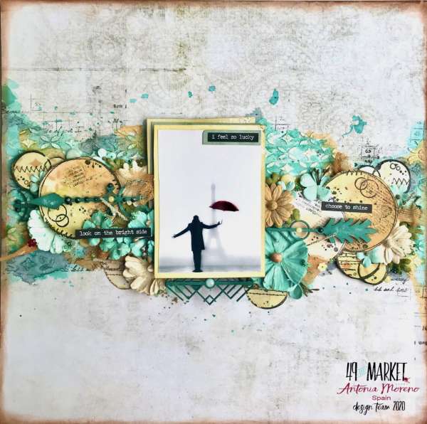
How amazing is this Mixed Media layout from Antonia!? She concentrated all her design elements in a border across the center of her page. Add depth and texture from stenciling, layering and clustering stamped circles, wooden embellishments, 3D flowers and mesh. I love that she kept the color scheme monochromatic with only creams and teal, it helps to keep the page cohesive.
Visit the 49th and Market blog for more info.
-Heather
Leave a Reply