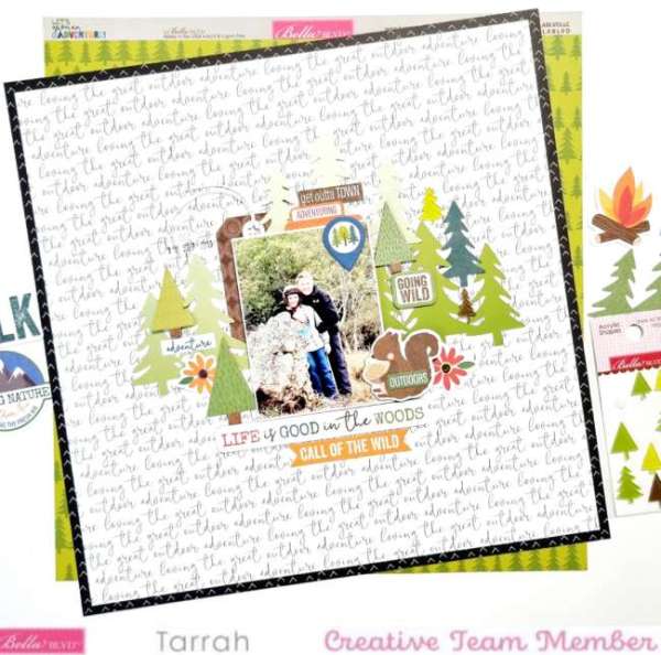
I love how Tarrah McLean kept her photo, title and all her elements towards the center of the page on this In the Woods layout. It’s a good reminder that it’s okay to leave plenty of “white space”, especially if you’re using a busy overall pattern paper for the background. It’s an easy design to put together that helps draw the eye to the center of page, directly to the photo.
Visit her blog for a closer look.
-Heather
Looking for more digital papers? Check these out over at Design bundle
Are you looking for more Embellishments, papers, and supplies? Check out today’s crafting deals over at Amazon.com.
Looking for more ideas? Follow our Pinterest Boards.



Leave a Reply