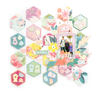
Terhi Koskinen filled the background of her layout with lots of die cut hexagon shapes of pattern paper. Each hexagon is filled with different die cut coffee themed images. The white of the background helps the patterns to stand out. She added clusters of elements around her photo to help draw in the eye.
Take a closer peek over on her blog.
-Heather


Leave a Reply