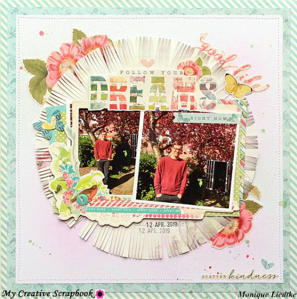
The large circle with fringe on this layout really pulls the eye into the center of the page, focusing on the photos. And adds extra texture as well. It was made by tracing a large round plate onto pattern paper and then cutting around the edge with fringe scissors.
You can take a closer look at how this page was put together over on the creating (non)sense blog.


Leave a Reply