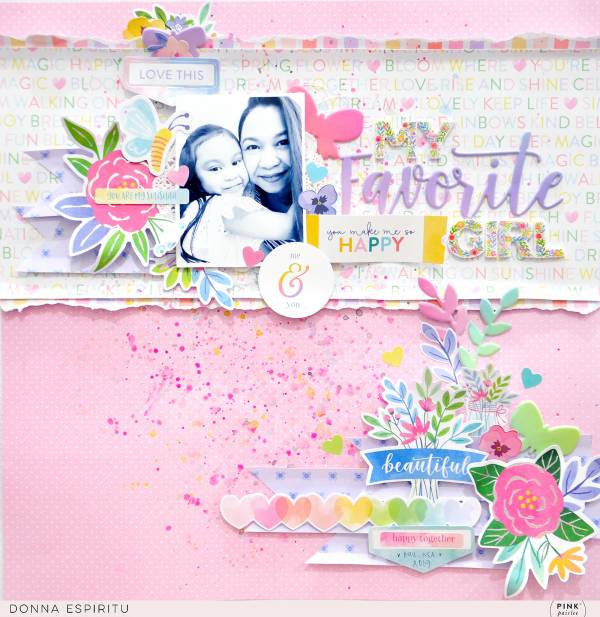
Donna created a thick boarder as the focus on her sweet My Favorite Girl layout. The torn layer adds some nice texture and the wide border has plenty of room for the photo, title with clusters of embellishments. Another cluster of accents at the bottom helps tie everything together.
Visit the Pink Pasilee blog for a closer look.
-Heather
Leave a Reply