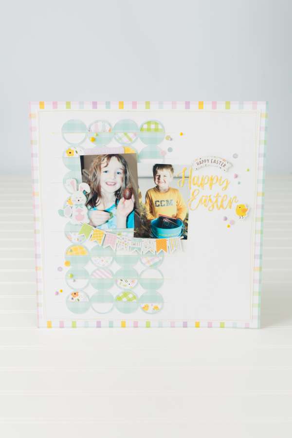
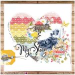
This sweet Easter layout has most of it’s “weight” on one side, with the rows of circle die cuts backed with pattern paper down the left side. The photos and embellishments are also oriented toward that side leaving room for the sentiment on the right with lots of white space. This is a great design tip that adds interest to the page design without making it feel busy or cluttered.
Visit the Echo Park blog for a closer look.
-Heather

Leave a Reply