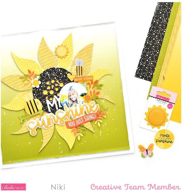
Niki used her Silhouette die cutting machine to cut a large Sunflower cut file from Bella Blvd as the focal point for this beautiful fall floral layout. To keep her chipboard title from blending in too much she backed it … Read More ...
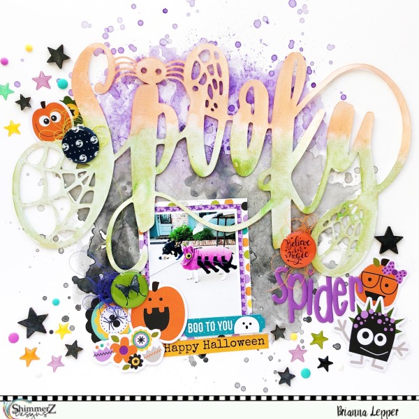
Spooky Spider Halloween Layout
Brianna used Shimmerz Paints to create a splashy watercolor background and colorful title for her Spooky Spider layout. These paints add both color and shimmer and are perfect for Halloween designs. Around her photo and title she added clusters of … Read More ...
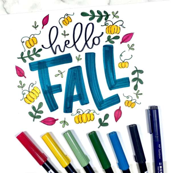
Hello Fall Hand Doodle Lettering
This fun “Hello Fall” doodle hand lettering is perfect to add to Autumn scrapbook layouts, planner pages or art journal designs. Marcella shows how to use markers for the lettering and how to draw the cute little pumpkin and leaf … Read More ...
Season’s Screamings Halloween Layout
I adore the puny “Season’s Screamings” title on this Halloween Scrapbook Page from Erica! She die cut her title from white cardstock, backing each letter in different pattern papers from Doodlebug Designs, adding some purple inking behind it to make … Read More ...
4 Cricut Autumn Die Cut Layouts
Julie used products from Close To My Heart and Cricut die cut shapes to create 2 double page Fall layouts, 1 with pumpkins, the other for Autumn Memories. I love the wooden sticker embellishments she added! She’s sharing a process … Read More ...
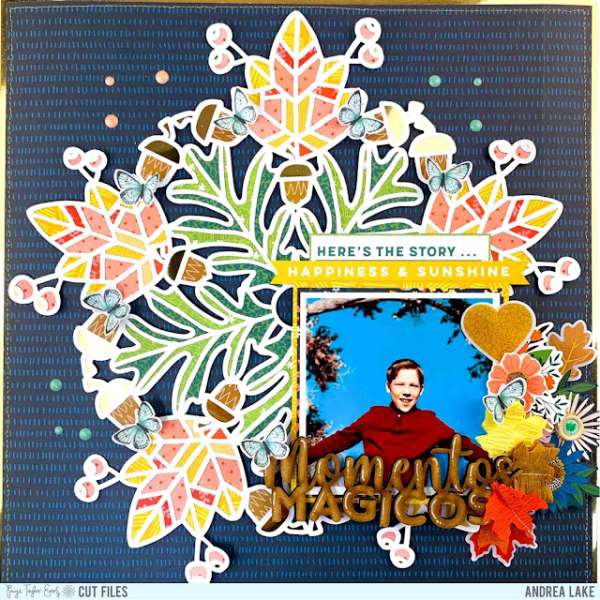
Autumn Doily Scrapbook Layout
Andrea used a large doily die cut as the focal point of this pretty Autumn Layout. She backed the dies openings with pattern paper, placing it over a dark background so it really stands out. The photo is in the … Read More ...
Fall Leaves Layout
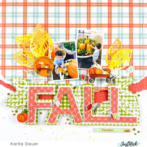
Karlla used an orange and green color combo pulled from her photos for this fun Fall Leaves layout. The large title die cut from white and backed with pattern paper really stands out against the bold torn and stitched plaid … Read More ...
Two Halloween Clustered Layouts
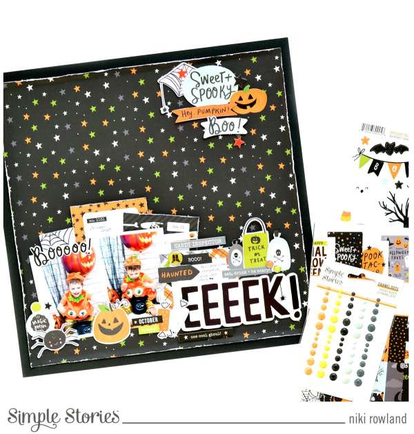
Niki used products from Simple Stories to create two wonderful Halloween layouts. For both designs she keep most of the photos, embellishments and text in large clusters either across the bottom or down the center of her pages. This is … Read More ...
Make Me Laugh Layout
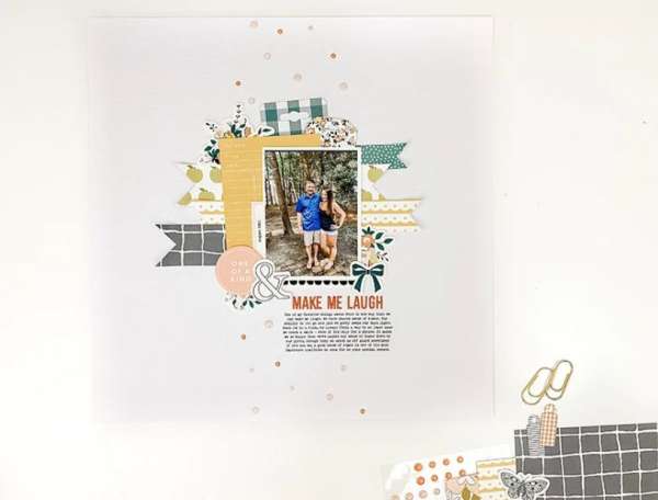
Shannon left lots of white space on her Make Me Laugh Layout which helps draw the eye right to the center of the design. Behind her photo she placed layers of pattern papers as well as strips of paper with … Read More ...
Stamped Sentiments TN Layout
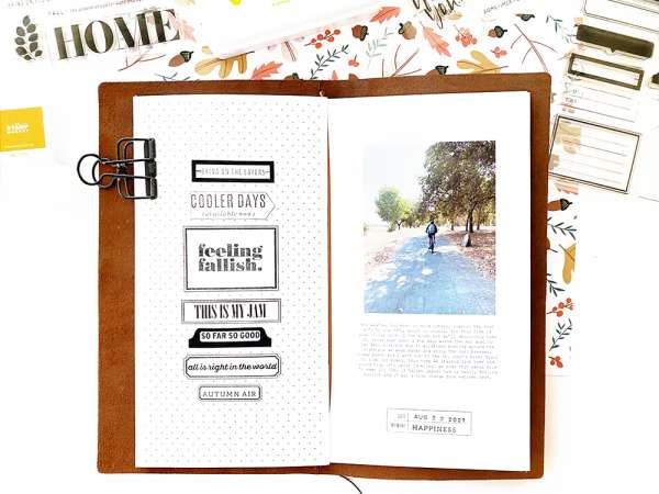
At a loss for words for a title, journaling or accents on a layout? Why not try stamps like Kerri did on her Traveler’s Notebook pages. Sentiments stamped onto labels (which were also stamped :)) are stacked up on one … Read More ...
You Captured My Heart Baby Layout
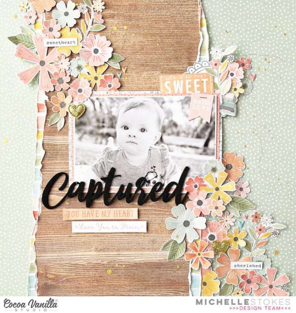
I love the combination of the hard of the woodgrain and the soft of the florals on this sweet baby layout from Michelle Stokes. Tearing the pattern paper adds an even more rustic feel under all the clusters of fussy … Read More ...
Fall Leaves Stamped Layout
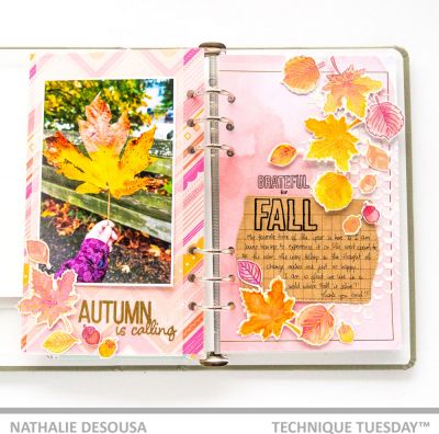
Nathalie used stamps and dies from Technique Tuesday to create this wonderful Fall double page layout. One side has a large photo with a few leaves and stamped title, the other side has a cascade of falling stamped leaves and … Read More ...
Autumn Leaves Layout
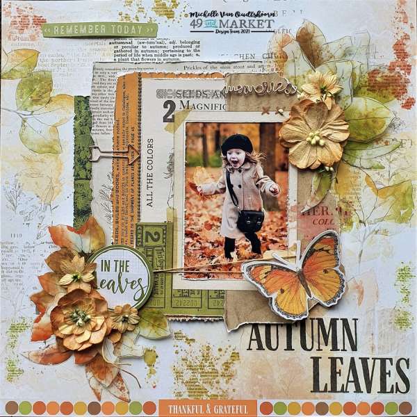
This beautiful Autumn Leaves layout from Michelle perfectly captures the feel of Fall! The mix of text and watercolor leaves make a soft background with layers of distressed pattern papers underneath the photo and clusters of 3D flowers. I love … Read More ...
Blessed Fall Layout with Sketch
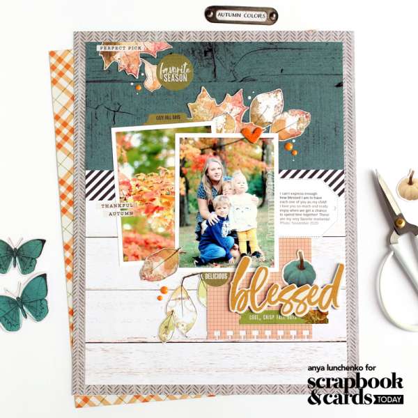
Anya used a brand new scrapbook sketch from the latest issue of Scrapbook and Cards Today magazine for this Blessed Fall Layout. Sketches are the perfect place to start if you’re stuck for ideas and remember you don’t need to … Read More ...
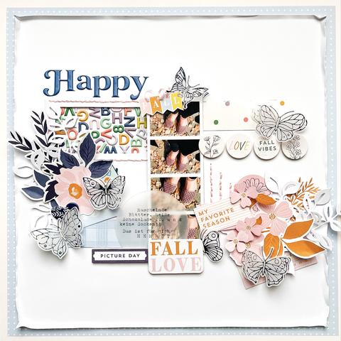
Happy Fall Scrapbook Layout
I don’t normally think butterflies when I think of Fall of but Kerstin really makes them work on this beautiful Happy Fall Layout. She mixed her foiled butterflies with navy, pink and orange leaves, lots of text and photos in … Read More ...
