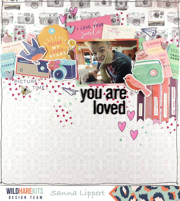
Sanna has an amazing balance of “white space” on this “You are Loved” Layout. With a busy pattern paper, the photo, title and most of the embellishments concentrated at the top of her page and a more simple paper at … Read More ...
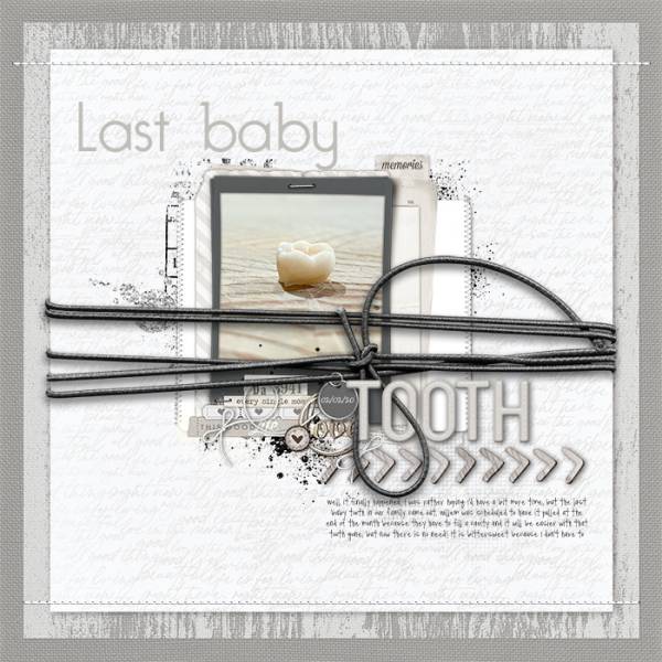
Baby Tooth Layout in Only Greys
Designer Digitals has a color challenge this month to use only shades of grey. Grey is actually one of my favorite colors, I love the subtle tones and how it works so well with lots of other colors or all … Read More ...
Heart Strips Layout
You know those little strips at the bottom of 12″ x 12″ pattern paper where the barcode is? I normally trim them off and throw them away but boy, I should have been saving them! Because Paige Taylor Evans had … Read More ...
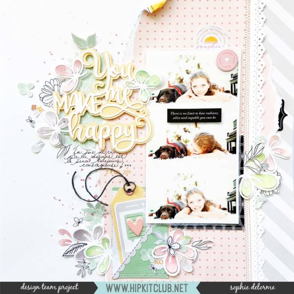
You Make Me Happy Layout
Sophie balanced her trio of stacked photos on one side of her page with her large title die cut on the other. She added color to her die cut flowers with inks and paint. She torn pattern paper and stitched … Read More ...
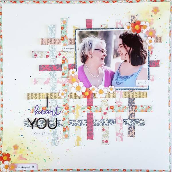
Paper Weaving Layout
Danni Vee used strips of pattern papers for a loose basket weave design on her “I Heart You” layout. This is a such a terrific way to use up scraps of paper! I love the flowers she scattered around and … Read More ...
A Swirl of Butterflies Layout
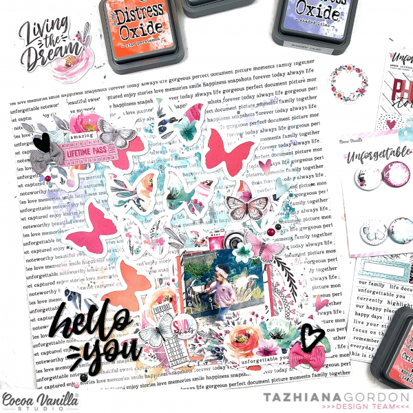
With a cluster of embellishments around the photo and a swirl of butterflies this layout from Tazhiana is truly magical. A wash of Distress Ink over the background break up the busy text pattern and help add movement across the … Read More ...
Mini Travel Album
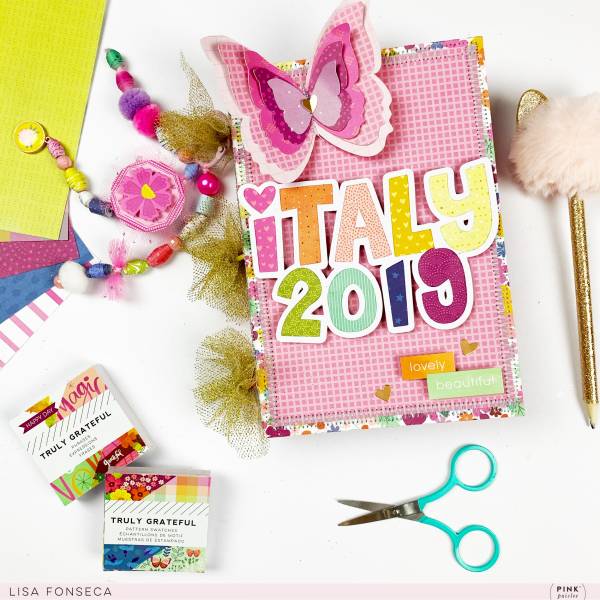
Lisa Fonseca designed a 3 ring binder album to document her trip to Italy. The bright colors and boho style give it a colorful and trendy feel. I love how she added stitching around the edge of each page as … Read More ...
Much Love Valentine Layout
Joanna used a fun “Much Love” Heart shaped cut file to fill almost her entire Valentine scrapbook layout. Using different pink and red papers behind each letter add loads of texture and pattern to the page. The cute little sloths … Read More ...
Snapchat Traveler’s Notebook Pages
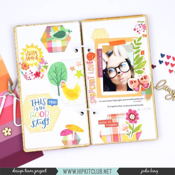
Fun filters on Snapchat make for super cute photos. Jodie used one for a sweet double page spread in her Traveler’s Notebook. The trendy hexagon shapes and spring embellishments make for a sweet and colorful set of pages.
Masculine Valentine’s Day Layout
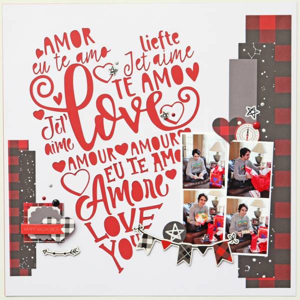
Aimee used a large heart shaped die cut design filled with loving sentiments as the focal point of her Valentine’s Day layout. I love how she added black to the traditional red for a more masculine feel and the plaid … Read More ...
Mandala Layout
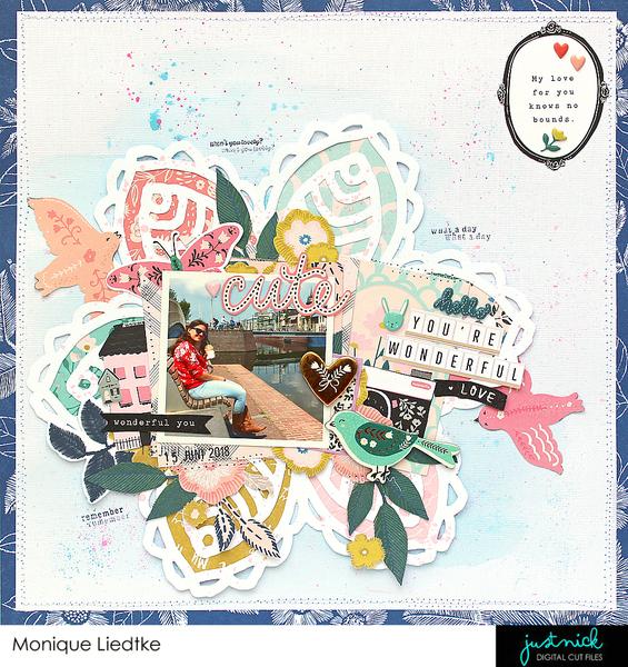
Monique created this Mandala layout with a trendy Boho vibe using a cut file from Just Nick. I love how she used different colors of pattern paper inside each section of the Mandala and clustered funky embellishments and phrases around … Read More ...
Romantic Layout
This layout from Jennifer has a vintage romantic feel to it with pink roses and typed text papers. She echoed that typewriter font in her journaling and added stitching around her pattern papers for extra texture on the page.
Take … Read More ...
Winter Layout
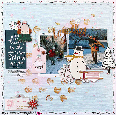
Monique stenciled gold paste and sprayed pink Distress Oxide spray on to blue cardstock to create the background for her frosty winter layout. Keeping her photos, journal card and most of the cute embellishments in a row across the center … Read More ...
Flower Show Layouts
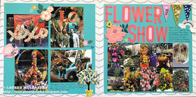
Lauren used a sketch as inspiration for her Flower Show double page spread. The grid of 4 photos on one page is nicely balanced out by the larger photo and title on the other page. And there’s still plenty of … Read More ...
Boho Love Layout
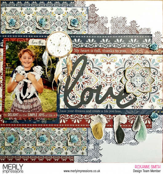
The new Grand Bazaar line from Kaiser Craft has an exotic and Boho feel to it. Roxanne used it for this wonderful layout, the flowers, feathers and dream catcher all work together for that trendy bohemian vibe. She’s sharing step … Read More ...
