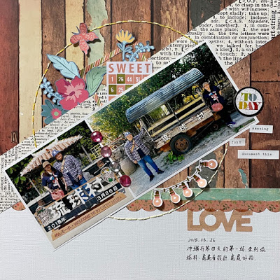
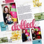
Rainny used a sketch as inspiration for this angular layout design. You can add so much interest just by mixing different lines, directions and angels. In this layout there are vertical strips in the background, a circle in the center and then pattern paper and the photos at a diagonal across the page. Don’t be afraid to mix things up, you might be surprised at the results.
Visit Rainny’s Creative World for a closer look.
-Heather Looking for Sewing supplies? Check out Sewing Machine Plus.


Leave a Reply