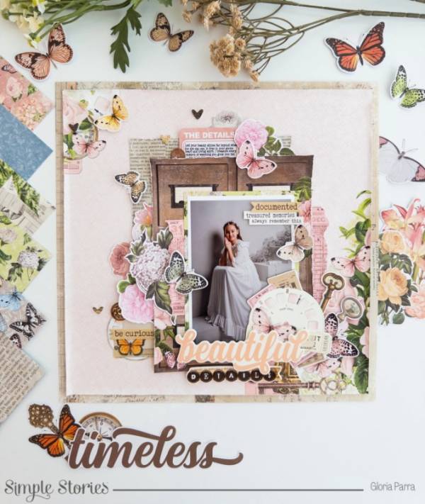
Gloria’s beautiful layout has wonderful vintage images like a library card catalog, view master wheel, metal keys, tickets and torn ledger papers. These harder images are balanced with softer florals and butterflies for a harmonious design. Take a closer look at the Simple Stories blog.
Everything old is new again, that’s the saying, right? Meaning everything, especial styles, come back around and becomes popular again. In crafting we use terms like “vintage”, “heritage” and “retro” to describe anything old fashioned, whatever’s not modern or current and it could be anywhere from the Victorian era, to the roaring 20’s (1920’s of course), to the kitschy 60’s or psychedelic 70’s. Each of these time periods evoke certain feelings and can help us to capture the mood of a different time even on scrapbook layouts that use current photos and of course when using vintage pictures too. So let’s explore some ideas that include a hint of nostalgia with vintage design.
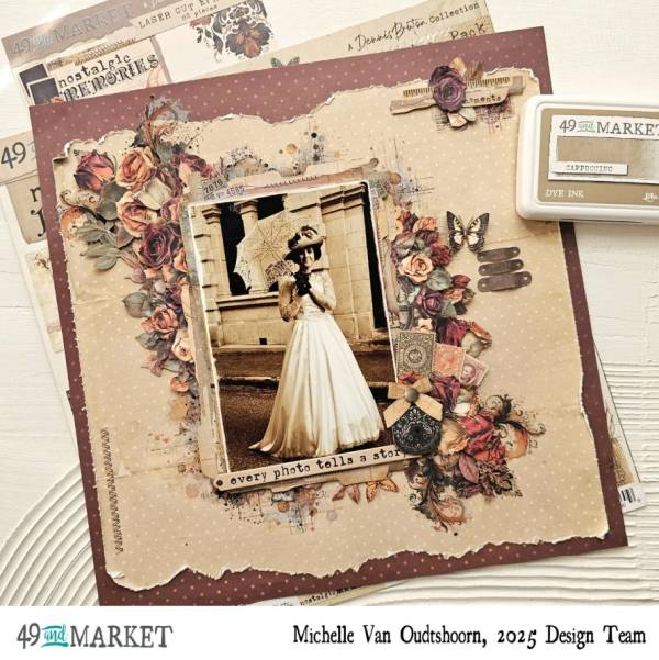
Sepia tones always give a feeling of a by gone era like on this lovely layout from Michelle. Random stitching, torn paper edges, distressing and simple polka dots create a vintage backdrop to the large photo that is surrounded by lots of roses in rich deep tones accented with tabs, postage stamps and a pocket watch. Learn more at the 49th and Market blog.
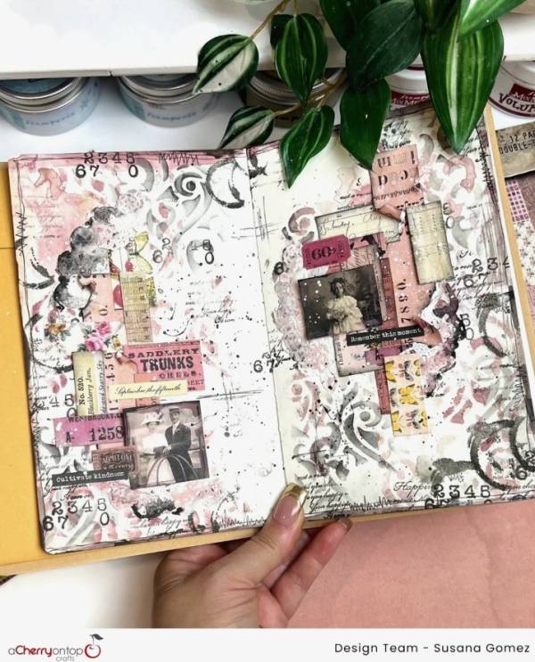
Susana’s double page journaling spread had loads of rustic and distressed charm. There’s layers of stenciling with pastel watercolors, washes of paint, stamped words and numbers, torn pattern papers and hand drawn faux stitching, doilies, tickets and lots more in black and white with sweet pops of pinks. She breaks it all down over at A Cherry on Top blog.
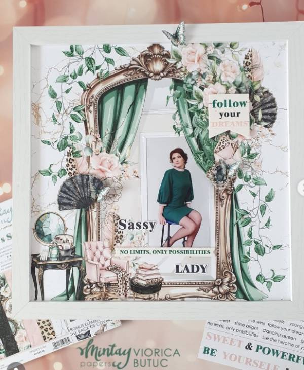
Viorica’s elegant layout feels inspired by fashion spreads from the 40’s and 50’s with wonderful teal green as the main color. The layout is mostly just pattern paper with a bedroom scene along with the photo and some sentiments added for a quick but effective vintage look. I spotted her idea on the Mintay Papers Instagram page.
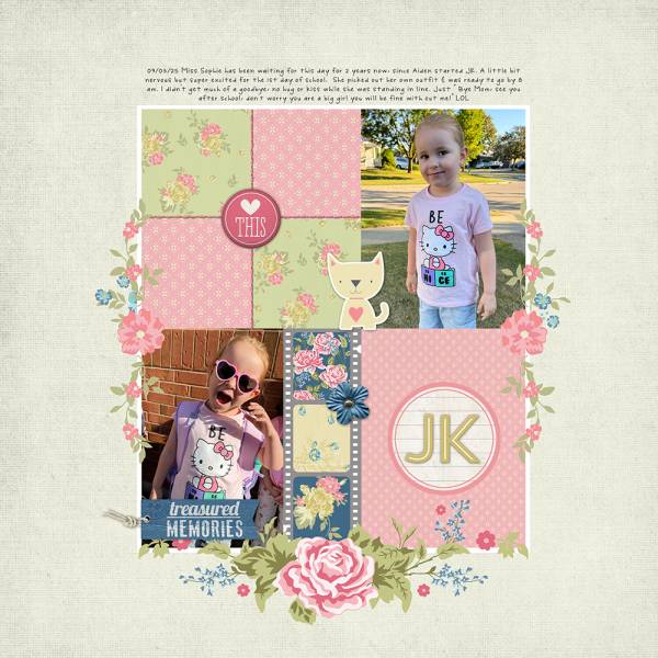
Adding a quilted look always gives a warm, homey feeling of the past, even for modern day girly photos. Erin used smaller prints of patterns, a vintage film strip and boughs of flowers all in soft colors for this sweet digital design. Find more details at the Katie Pertiet blog.
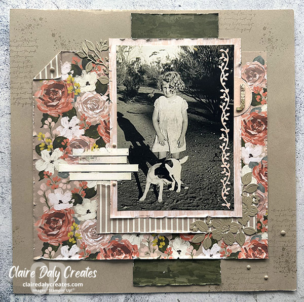
Rich dark tones and deep florals and stripes help give a vintage look to Claire’s darling girl and dog layout. She’s distressed the paper edges, added stamped splatter and text to the background as well as included some die cut flowers and vines too. Take a closer look at the Claire Daly Creates blog.
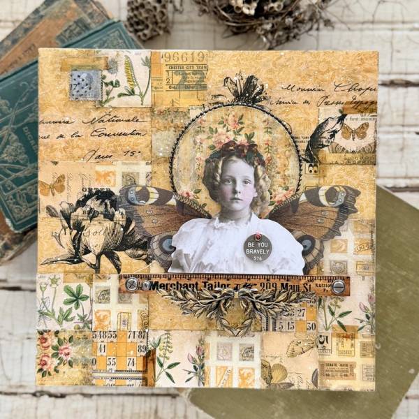
Tim Holtz and Ranger make some of my favorite vintage inspired paper crafting products, some of which Paula used here. She used a print of a vintage photo but you can use an actual photo too, adding fairy wings behind her with a border of rulers, metal brads and painted metal laurel leaves. But the stand out is the amazing background made up of small cut squares of pattern paper with inking for an aged feel. Find directions over on the Simon Says Stamp blog.
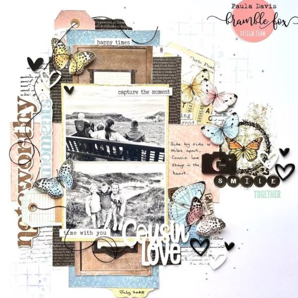
I love the pastel pink and blues mixing with browns and black on Paula’s page! Using black and white photos helps with the vintage feel as well as tied tags, a wood cabinet, typewriter keys, splattered paint and grid stenciling. These items still mix well with more current embellishments like thick acrylic words and hearts. Find more details at the Bramble Fox blog.
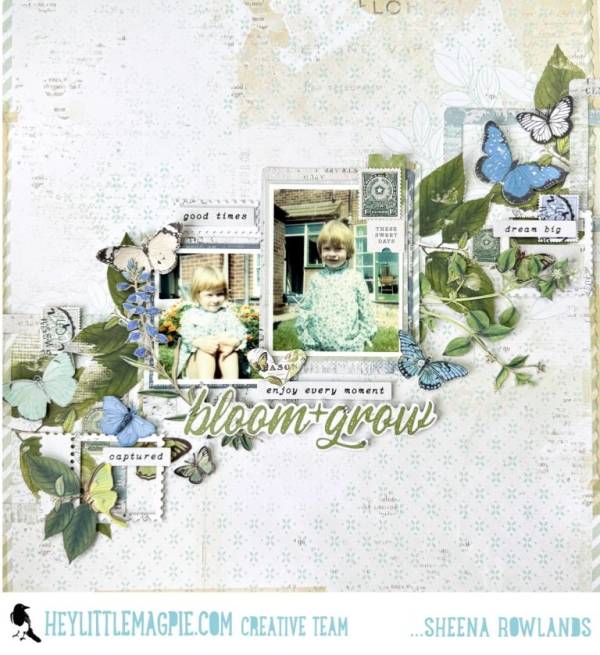
As we’ve already seen flowers and butterflies in muted tones give a nice old fashioned feel. Sheena used accents that pulled colors from the vintage photos, she’s also used postage stamp frames, chipboard sentiment strips and the background paper looks like faded old wallpaper. Take a closer peek at the Hey Little Magpie blog.
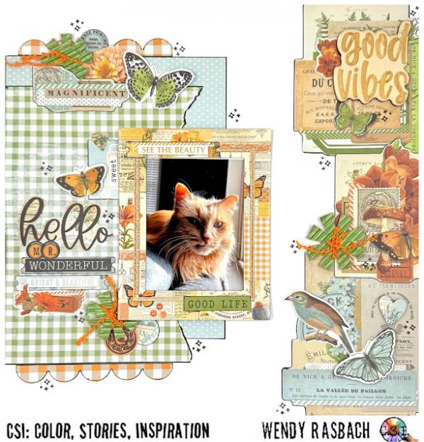
Wendy’s fabulous cat page has a vintage farmhouse vibe with lots of plaids and polka dots. She used labels, stamps, typewriter keys and ledger papers along with birds and butterflies that have a nature journal feel. And I love the little pom poms she made wrapping fibers around “snowflake” shapes. Take a closer look at the CSI: Color, Stories, Inspiration blog.
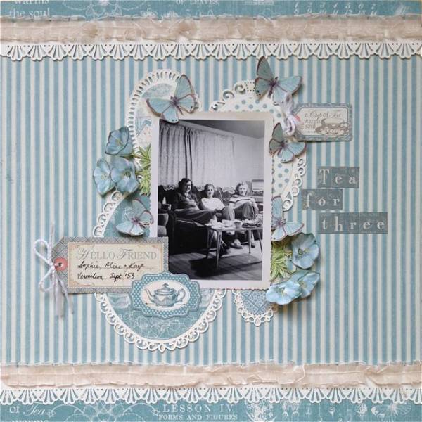
Kelly’s design is so simply vintage with cream lacy edges and doily frames, blue striped ticking, soft gathered ribbon and different patterns of pretty blue papers. I love the raised flowers and butterflies, they add such nice dimension! Find all the details at the Kelly Creates blog.
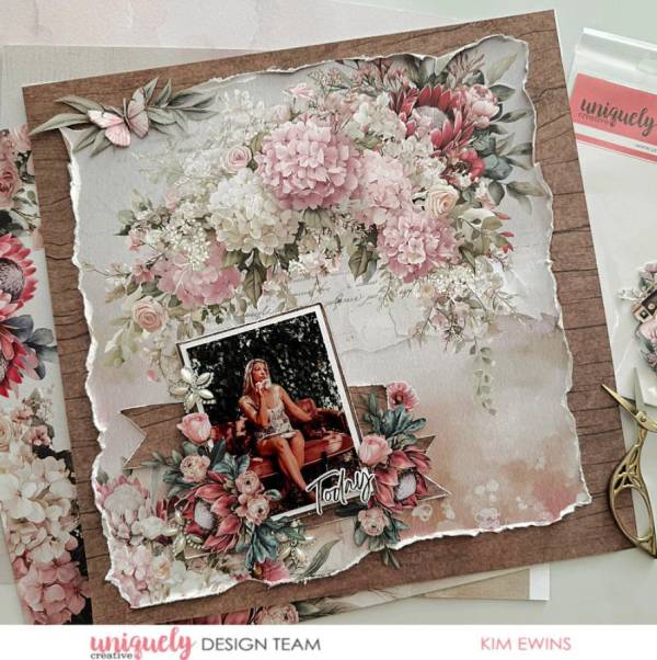
Kim used a pattern paper that did most of the vintage work for her with lovely flowers in both corners on a distressed pink and off white background. She tore and curled the paper edges, placing it on dark woodgrain paper, adding planks of that same paper behind the photo along with fussy cut flowers and pearl gems clustered on the pic. Leanr more at the Uniquely Creative blog.
I hope you’ve been inspired to add some vintage touches to your future designs.
-Heather
Looking for vintage inspired scrapbook supplies, we recommend A Cherry on Top.com