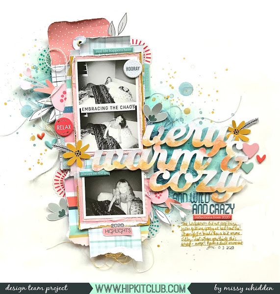
Missy Whidden die cut her page title from textured cardstock and then added paint across the bottom of each letter for a subtle ombre’ fade. She also added gesso and Shimmerz paint to her background to carry the watercolor look throughout the design. I love how she spaced out her stack of 3 photos to look like a vintage photo booth strip.
-Heather

Nicely done layout!