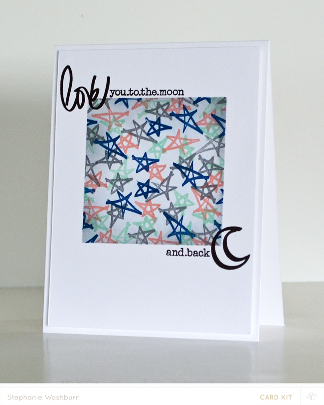
Learn some stamping and blending and blending techniques, with this tutorial from Sweet Steph Card Designs. Make a card as shown above, or a background element for a scrapbook page.
Have you read?
12 Blue Winter Scrapbook Layout Ideas
This adorable Winter layout has so many shades of blue from pastel to navy with lots of different patterns too for a very dynamic layout. In the center is a little polar bear on an iceberg scene with sentiments, journaling and some falling snowflakes. Learn more at the Creative Memories blog.
I love using monochromatic color schemes, it’s a fun challenge to try to stick to using only shades and tones of a single color. When I think of Winter colors I think of blue, in the hues of the snow, ice and the sky. Plus blue is my favorite color no matter what tone of blue it is. So let’s take a look at some beautiful Winter Scrapbook Layouts that mainly focus on the color blue to help get you inspired to try a monochromatic design.
Beneath each photo you’ll see a link, click it for more details like products used, tips and tricks.
This darling layout is full of all those items we need to bundle up for Winter. With die cut coat, boots, hat, mittens and a cozy snowman. I love the trendy teal blue and the textured paper Merriweather used for her die cutting! I spotted her design on the Scrapbook.com blog.
Nancy die cut a circle frame with snowflakes from a grey/tan cardstock, adding additional die cut snowflakes in blue and cream with gems over top. There’s also a blue background, large title and cute snowman that work so well with the beautiful Winter photos. Take a closer peek at the Printable Cutable Creatables blog.
Nathalie’s Winter Wonderland layout has so much texture from layers of torn pattern papers in shades of blue. Behind the matted photo she’s got tied tags, falling snowflakes, words and paint splatter in a V pattern. Spy the tiny penguin too, so cute! Find more info at the Doodlebug blog.
This beautiful blue layout has lots of text from a detailed die cut title, journaling and embellishments with words. The stenciled snowy background adds lots of great movement too. Michelle used a die cut file from Peartree Cutables for this page. I came across it on her crea_chelle Instagram page.
This frosty double page layout uses blue cardstock with subtle stamping for the background and wide borders of two pattern papers across the top. Soft pink mats behind the photos and green and red embellishments add some extra pops of color. Learn more about Kate’s pages on her Ink Stamp Share blog.
Inesa has lots of texture on her Winter fun layout with paint splatter on textured cardstock, stitching with gold thread and popped up die cut title backed with pattern papers, puffy stickers and epoxy gems. She also added some cute images like a snow globe and penguin as well. Find out more at the Bella Blvd. blog.
This amazing grid layout uses lots of blue and a cut up photo for the background. The large photo was cut into squares and spaced out evenly for a cool technique. It works perfectly with the photo that features a window pane that looks like a grid as well. These also a large die cut snowflake and title with strips of journaling. Take a closer look at the Mosaic Moments blog.
The beautiful blue mixes with gold for a wonderful Winter design from Suz Lee. She created two wide rows across the design made up of photos, frames and journaling cards. There’s also lots of glittery snowflakes and words scattered throughout too. I spotted her page on the Elle’s Studio Instagram page.
Traci created a double page layout with each page being 6″ x 8″ by using a printed 12″ x 12″ paper and cutting it in half to keep the snowy village scene intact. She added plaid mats for the photos along with chipboard frames, stickers, rub-ons and die cuts too. Learn all about it on the Cocoa Daisy blog.
Incorporating a calendar is a fun way to show what date the layout is presenting like Dana did on her January page. She also made some amazing icicles using white paint, texture paste and glimmer mist on chipboard shapes. There’s also some acrylic shapes and felt for even more texture too. Find all the details at the Call Me Tatar blog.
Who says a starburst can’t work for Winter? Jessica used a large black burst on the background of her layout with the photo in the center and added words and sentiments along the lines of the burst. There’s also a blue acrylic title and lots of fun little sequins and embellishments too. I came across this on her Jessica E Michaels Instagram page.
I hope you’ll grab some blue hues and try some frosty monochromatic Winter layouts yourself!
-Heather
Looking for paper crafting supplies? Check out Craft Stash
Leave a Reply