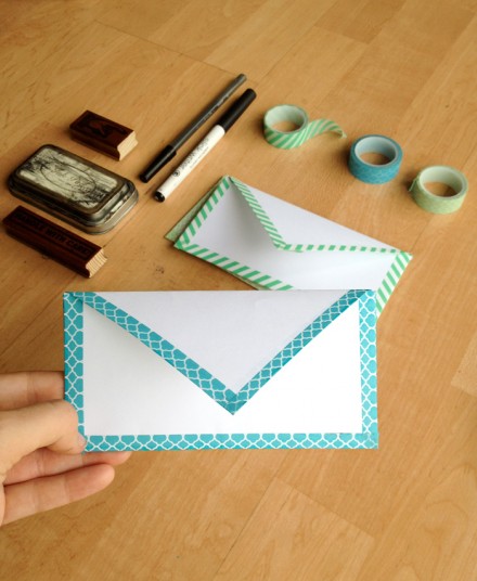
Use regular printer paper and washi tape to make these seriously cute envelopes! Pair with a card and you’re ready to gift to mom this Sunday. Get the folding and taping instructions from Kendra at Key Lime Digital Designs.
Themes, layouts and inspirations
Use regular printer paper and washi tape to make these seriously cute envelopes! Pair with a card and you’re ready to gift to mom this Sunday. Get the folding and taping instructions from Kendra at Key Lime Digital Designs.
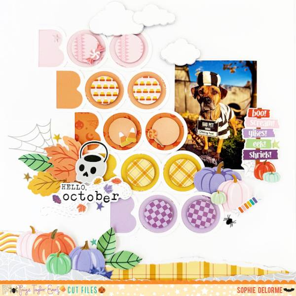
Sophie’s darling doggy design has a mix of orange, yellow and purple with fun plaids and patterns. I love the repeating “BOO” words going down, all the colorful pumpkins and the torn paper for some texture. Repeating a single word is a great way to fill up space and add emphasis. Take a closer look at the Paige Evans blog.
If scary and creepy aren’t really your style it’s ok to do sweet and cute for Halloween, in fact it’s a really big trend! With soft pastel colors, happy ghosts and smiling Jack O’ Lanterns, cute is what’s in for this Halloween. So if you’ve got little ones who are too cute to spook or silly Halloween pet photos to scrap you’ll want to check out all these Halloween scrapbook layout ideas that are on the softer side of spooky.
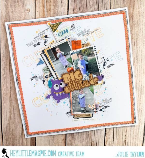
Julie’s adorable layout used repeated stamping in colored and black ink pads to create a cool custom background. Behind the photos are layers of distressed pattern papers, a purple monster patch, there’s also a wooden title, tickets and chipboard flags. Learn more at the Hey Little Magpie blog.
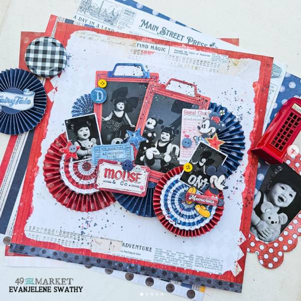
You don’t even need Halloween supplies, just go with the theme of the costume like Evanjelene did here with darling Minnie Mouse photos and traditional primary Disney colors of red, white and blue. There’s 3D folded paper rosettes, black and white photos mounted on tabbed panels, tickets, stars, splatters and more with a retro mixed media feel. I spotted her idea on the 49th and Market Instagram page.
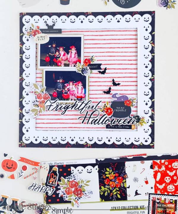
Nathalie create an amazing frame for her cute Halloween layout by cutting the frame out from paper that has pumpkin faces scalloped around the edges, adding dark orange striped paper in the center on a fall floral base. She offset her pics with a bubbling cauldron with flying bats, more fall florals and a chipboard title. Find all the details at the Simple Stories blog.
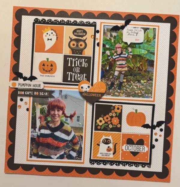
Marci’s sweet Pippi Longstockings orange and black layout uses a grid formation with 4 large squares but inside of two squares are smaller printed squares fussy cut from pattern paper. There’s small scalloped borders with a large scalloped frame, fun little sign, bat embellishments, word bubble and black and orange sequins. I came across her idea in her Marci LB gallery at Scrapbook.com.
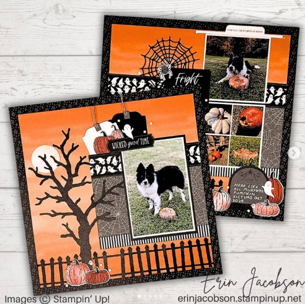
Erin’s dog loves to chew up pumpkins which makes for a funny and adorable set a double page layouts for Halloween. One side has an orange sky, picket fence, and creepy tree, the other side has a large moon, both have layers of spider web and striped papers with stamped and colored pumpkins. I spotted these at the Crafty Concepts with Erin Instagram page.
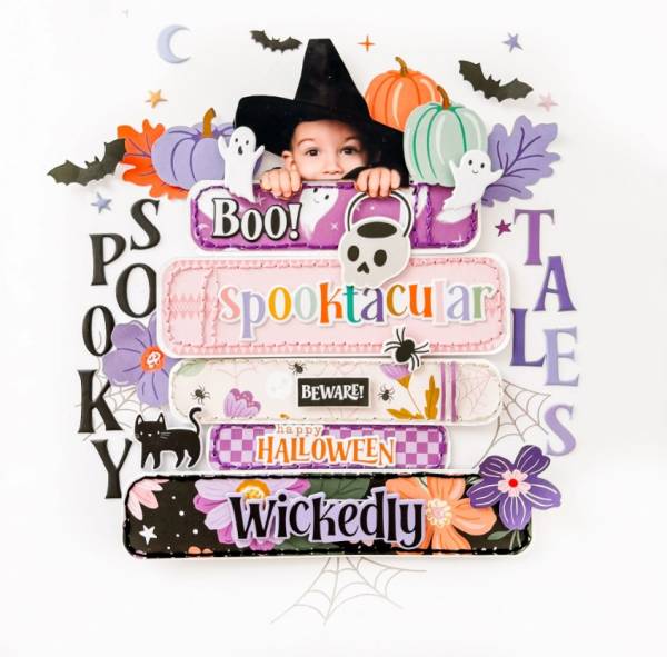
Susi designed a stack of Halloween books made of pattern papers and stitching with the worlds cutest witch peeking over the top. Cutting out photos add such a unique touch! There’s also chipboard ghosts, puffy letter sticker spelling out the title, bats, cats and pumpkins too. Find step by step directions at the Pinkfresh Studio blog.
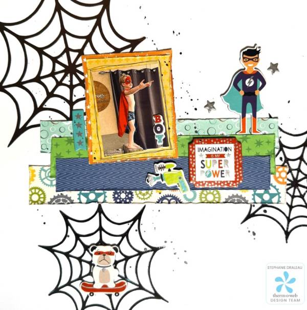
Stephanie accented her Super Hero layout with big bold spider webs made with shimmery Deco Foil. In the center is a stack of pattern papers, a super hero, some embellishments and a sentiment with more papers stacked behind the pic. I love the little dog side kick in the web! Find direction at the Therm O Web blog.
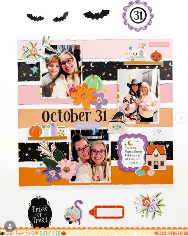
Inessa created a custom background using distressed strips of cardstock and pattern papers going down the center. She mixed florals with Halloween images in pretty purple, pink and orange with die cut letters for the date and a journaling card to document the day. I spotted this on the Paper and Bling Instagram page.
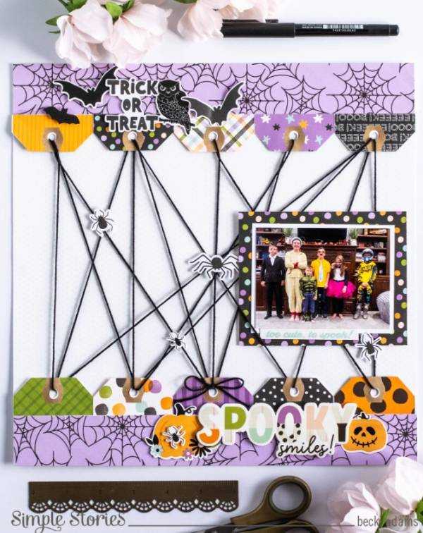
Becki put a twist on a spider web by connecting pattern paper tags, tucked behind borders of web paper, with black twine and adding tiny spiders on the threads, so fun! She added a chipboard title and clusters of Halloween embellishment on both borders too. Find all the details at the Simple Stories blog.
I hope you have a very sweet Halloween!
-Heather
Looking for more stamps and paper crafts? Check out the papermaking supply section over at Therm O Web.