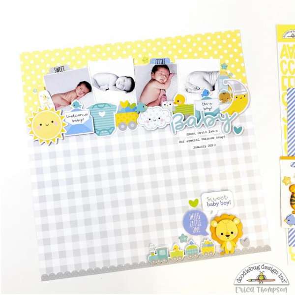
I love this adorable baby layout from Erica. She was able to get several photos on the page still having lots of white space and room for cute embellishments, a tiny title and a little journaling. I love the color combo, the grey softens out the bold yellow and also reflects in the color and black and white photos.
Visit the Doodlebug Designs blog for a closer look.
-Heather

Leave a Reply