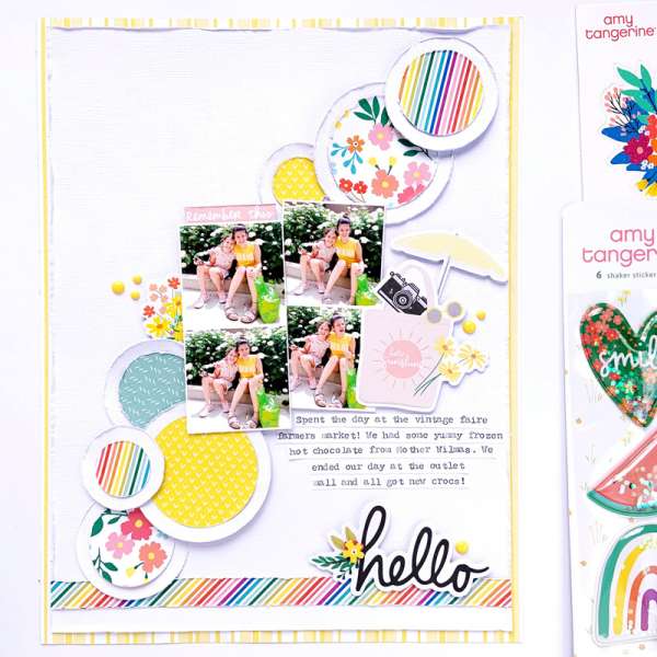
When you’re pressed for layout ideas try going back to the basics, with basic shapes like circles. The large swath of circle diagonally across the background of the page from Erica adds lots of movement and color. And she balanced them out perfectly with a grid of 4 square photos.
Visit the Scrapbook and Cards Today blog for more.
-Heather


Leave a Reply