Creating Keepsakes magazine, arguably THE magazine for scrapbookers worldwide announced today that its November/December 2013 issue will be its last one. Starting in January CK Media will publish a digital magazine called Paper Crafts & Scrapbooking. Current subscribers will receive two digital issues for each month left on their paper subscriptions. Although it has been years since I subscribed to the magazine, I am sad to see it go, as it has been around for as long as I have been scrapbooking. What do you think? Is digital the way to go? Click here to see the complete announcement from CK.
Comments
Have you read?
10 Christmas Scrapbook Mini Album Ideas
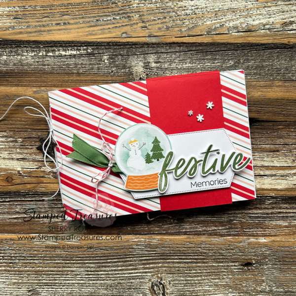
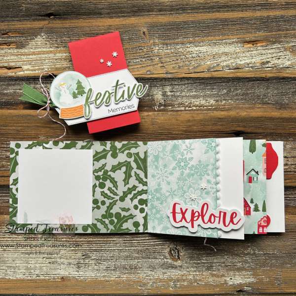
Sherry created a long shinny album for the Holidays with a festive belly band to keep it closed. Inside are pattern paper pages with pom pom trim, a few tabs and embellishments and plenty of room for photos. Take a closer look at Stamped Treasures blog.
I know I say this all the time but I love creating mini albums for a single occasion. It’s a great way to keep all those memories in one place, they are portable to share with friend and family and I find they are easier to keep cohesive than making lots of larger pages, especially when using the same designer/product collection in a single mini album. Most of us take so many pictures during Christmas and the Winter Holiday season so it’s the perfect occasion for a mini album!
Today we’ll take a look at Mini Christmas Album ideas with a photo of the cover and one of the inside, click the link below the picture to see the entire album project, find what products were used and maybe some tutorials too.
Maria also create a long mini album but the ends of her pages look like tags with eyelets and tied green ribbons. I love this vintage inspired, traditional look! Inside pages are decorated with washi tape, chipboard elements, stickers and lots of pattern papers. Visit the Graphic 45 blog for all the details.
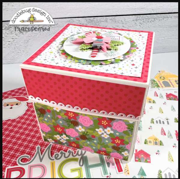
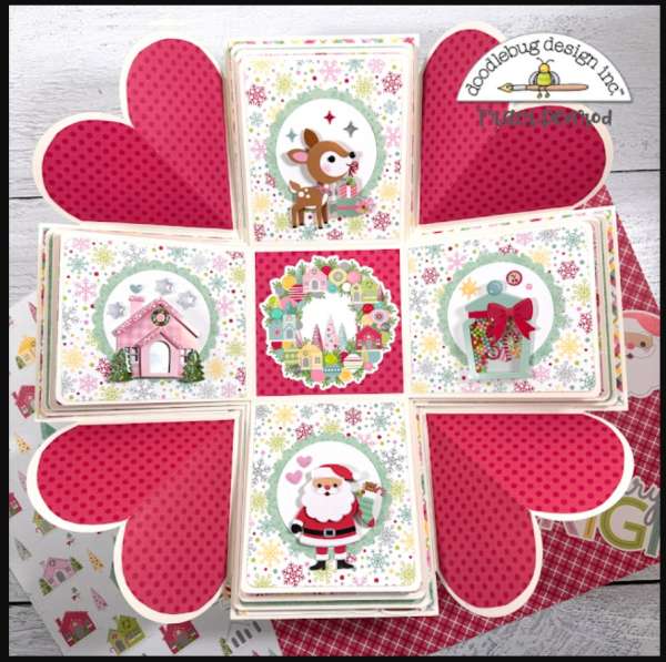
At first glance this darling box doesn’t look like an album but when you lift the lid an explosion album opens up and is revealed. Traci created 4 sections of flap pages that each have detailed decoration on the tops and pages that have pockets to slip in addition photos or journaling. And the fun heart elements that make up part of the box sides add a sweet touch too. Learn more at the Doodlebug blog.
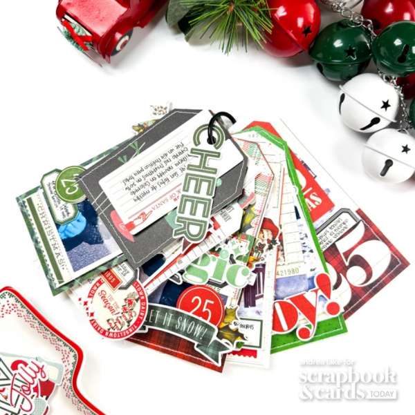
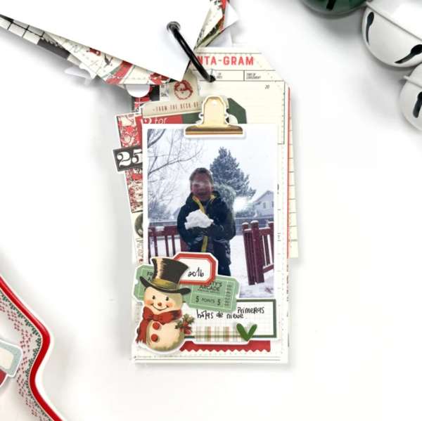
This sweet Christmas mini from Andrea is made up of just tags but some are different sizes and most are stitched around the edges. There’s not really a cover just a simple “Cheer” die and it’s all held together with an O ring. The tags have lots of vintage inspired patterns and images with labels, stickers and tickets. Take a closer peek at the Scrapbook and Cards Today blog.
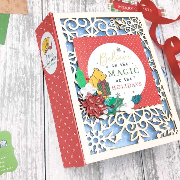
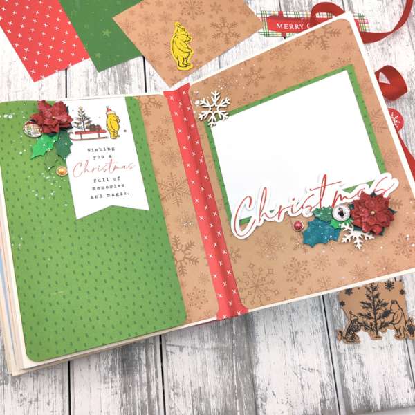
I have always loved Pooh and all his friends in the Hundred Acre Woods! And so does Jessica who created this wonderful Winnie the Pooh mini album using mostly products from Echo Park. She started with a chipboard album that has snowflakes cut from the cover. Inside she used stamps, stickers, chipboard elements, brads, dies and pattern papers to decorate her pages, there’s also fun design elements like flaps and pockets with removeable cards. Check out the entire album and watch her process video at The Cherry on Top blog.
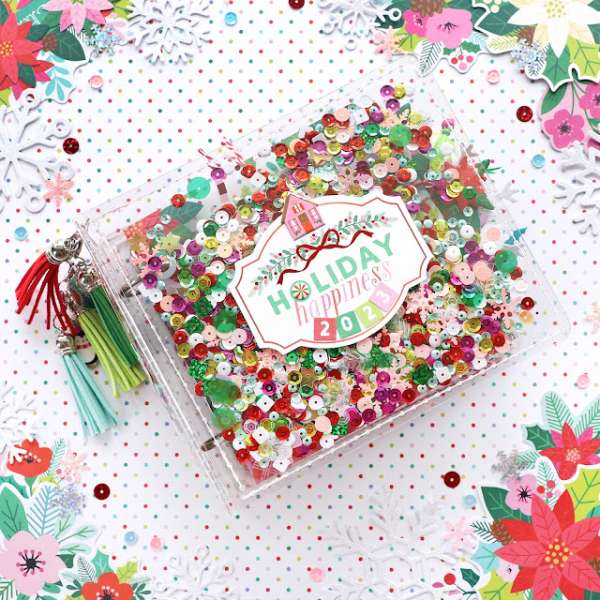
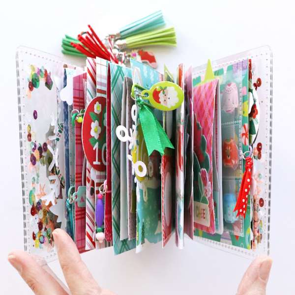
This little but thick and chunky Christmas album by Paige measures 4″x 4″ and has a clear acetate cover that’s stuffed full of sequins with a large Holiday label on top. There’s also fun tassels tangling from the spine. The pages each have a number to countdown to Christmas and are decorated with pattern papers, printed journaling cards and labels along with fun sections like flaps and a tiny pocket page. Watch a video walk through on the Paige Taylor Evans blog.
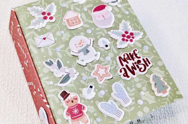
This terrific tiny album measures 3″x4″ and Annalisa thought of Christmas Puppets when she created it. The cover is covered in cute puffy stickers and the inside pages have peeking critters, die cut snowmen and lots of other fun characters. Check it out at the Moda Scrap blog.
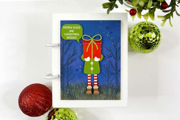
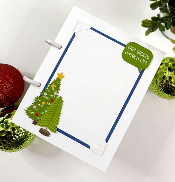
Babi says this album is perfect for beginners with a dynamic cover with clean and simple pages inside. The cover has an ink blended and stenciled background with cute die cut elf carrying gifts, his little legs even swing for some action. The pages are held together with discs and decorated with more die cut images, and simple photo mats with photo corners. Learn more at the Spellbinders blog.
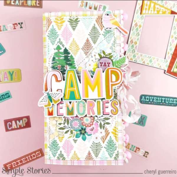
This jolly album from Dorymar is tall and stuffed full of many different elements and techniques. There are plastic pocket pages, pockets filled with tags, waterfall pages, flaps and envelopes and so much more. This tiny but mighty album will hold so many Christmas photos and memories. Find more details at the Simple Stories blog.
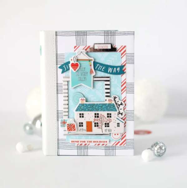
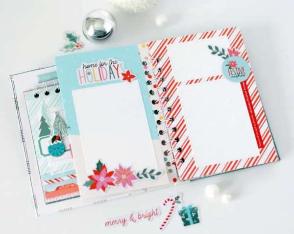
This wonderful Winter Wonderland of a mini album from Anya has lots of stark white with pops of trendy teal and red throughout. Inside there are two spiral bound sections of pages, one horizontal and one vertical decorated with candy cane stripes, puffy stickers and sweet sentiments. Take a look at the Hip Kit Club blog.
I hope you find some time after the busy Holidays to print your photos and create some cute mini albums yourself!
-Heather
You can shop some of our affiliate companies mentioned in this post:






I don’t do digital stamping or scrapbooking and I have a hard time reading digital mags, so no, i don’t thing this is the way to go.
I’m sad to see it go, but not at all surprised.
I hate everything going digital. I like holding something in my hand. I like being able to do a project outside, which I can’t do if it is digital. So now, if there is a storm, I will not have access to any projects. Our electricity goes out all the time. And if a companies computer goes off line, nothing is available. Couple months ago, it took 2 weeks to get a paper signed by my drs office, because their computers were being worked on and they couldn’t get into my file. This sucks.
Sad and angry to see it go. Digital is NOT the way to go. I like to look through my paper magazine on the couch, the bed, or even in the bathtub…can’t do that with a digital device. Seriously. What the heck is up with this world??!!