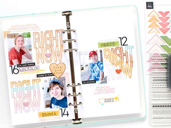
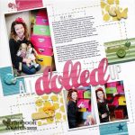
Repeating a word or phrase is a great way to fill the space on a layout and create a modern graphic look. This clean and simple Traveler’s Notebook spread from Kerri is the perfect example with the title repeated 3 times, each one is colored slightly differently though to keep it interesting. This design also has stamped sentiments and background elements to help add to that graphic feel.
Visit the Kerri Bradford blog for al the details.
-Heather
Looking for paper and scrapbooking supplies? We recommend checking out Craft Stash
Leave a Reply