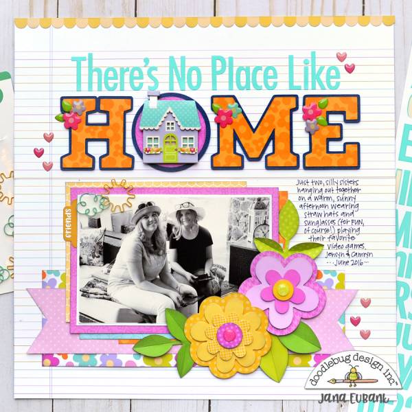
The bright and cheerful title and flowers are a perfect offset to the fun black and white photo on this No Place Like Home layout from Jana Eubank. The lined notebook pattern paper gives the perfect place to add journaling. And I love how she placed the house shape in the middle of the “O”!
Visit her blog for a closer look.
-Heather
Leave a Reply