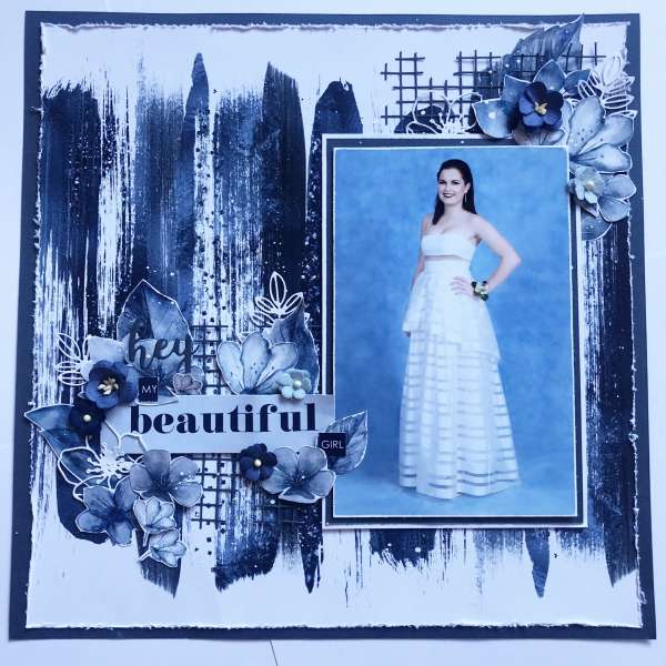
Tanya created this blue monochromatic layout that mimics the blue of the backdrop on the photo she chose for this formal dress page. The girl in her lovely white dress really stand out as the focus against all the blue. She also added clusters of flowers around the page title and one corner of the photo which add an extra feminine touch.
Visit the Paper Rose blog for more info.
-Heather


Leave a Reply