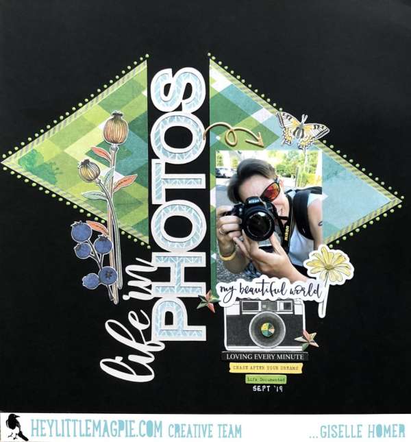
Being behind the camera we sometimes forget to put ourselves in our layouts. Be sure to take some selfies or have others take some pics of you to include in your albums and layouts. I love this bold and graphic “Life in Photos” design from Giselle, she used two colorful triangles of pattern paper on either side of the large vertical die cut title. Using a black background really helps all the elements of her design really pop!
Visit the Hey, Little Magpie blog for a closer peek.
-Heather
Leave a Reply