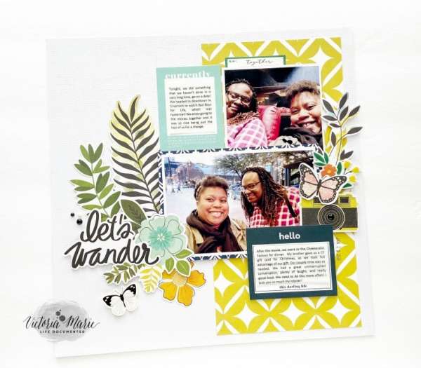
Victoria used clusters of flowers, leaves and butterflies all over her Let’s Wander travel layout. She also split her page in half leaving white space on one side and pattern paper on the other. Slightly offsetting her photos and journaling help add balance and the accent images fill in some of the white space.
Visit the Victoria Marie blog for her process video.
-Heather

Leave a Reply