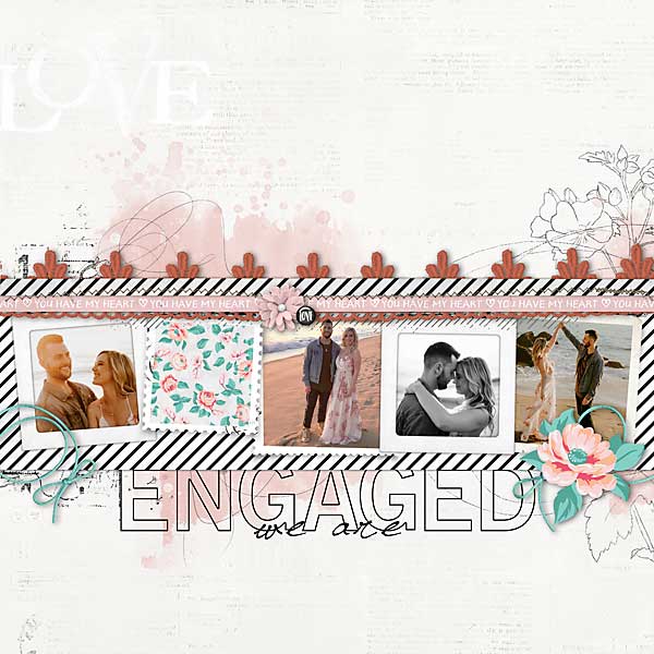
The design team at Designer Digitals used a similar page sketch to create several different layouts, with a row of photos across the center of the page. Keeping the title and embellishments close to the photos leaves lots of “white space” on the background for a clean look.
Visit their blog to see all their layouts.
-Heather






Leave a Reply