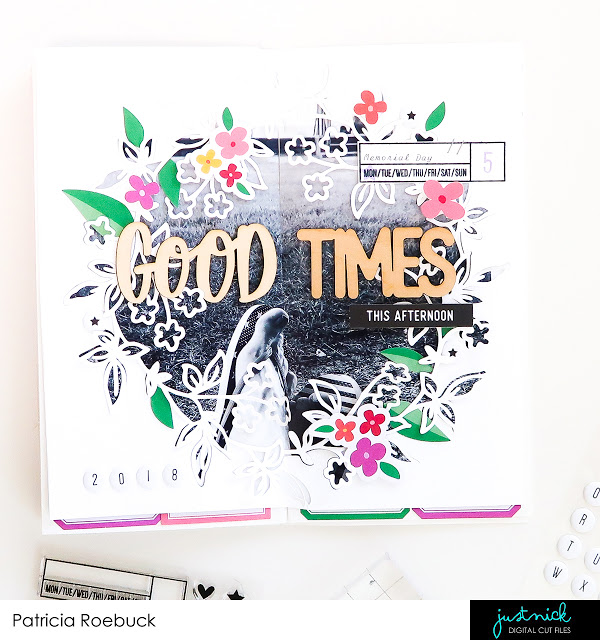
I love how Patrica designed this Traveler’s Notebook layout over two pages. She framed the large photo with a pretty floral die cut design and split it down the center. The wooden title adds a nice natural element and the dates in the corners add balance to the design.
Visit the Roebuck Adventures for more.
-Heather


Leave a Reply