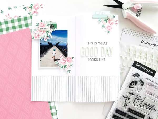
Sometime a beautiful photo, a title and a few embellishments are all that’s needed to create a lovely layout. Tina kept her 2 page Traveler’s Notebook layouts clean and simple, with white backgrounds, a colorful photo and a few clusters of flowers and simple accents. It allows the photo to really speaks for itself.
Visit the Felicity Jane blog for a closer look.
-Heather




Leave a Reply