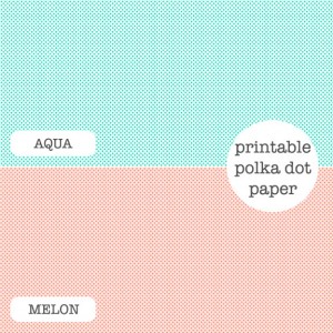
Enjoy these free polka dot papers from Ez of Creature Comforts. These colours make me feel like eating cotton candy! Go to freebie.
Trackbacks
Have you read?
12 Outdoor Autumn Scrapbook Layout Ideas
Stitched down zig zags of Fall patterned papers add color, texture and movement to this wonderful Fall Fun layout. The fun playing in the leaves black and white photos stand out against all the pattern and color. I spotted this idea on the scrapping_with_thamar Instagram page.
The leaves are changing colors, the weather is cooler but it’s still nice enough to head outdoors and go for a hike and enjoy the scenery, sit around the campfire, rake up or play in a pile of leaves or go to the orchard. Before it gets too cold let’s head to the great outdoors and then when we get back scrap up some wonderful Autumn Outdoor layouts.
Below each photo you’ll see a link, click it for more info like products used, tips and tutorials.
Niki cut out diamond sections from plaid pattern paper to cleverly draw the eye to each area and then added the photo and clusters of embellishments in each. There’s even some room for a bit of hand journaling too. Take a closer look over at the Simple Stories blog.
This beautiful Fall layout from Suzanna has an amazing mix of pattern, color and texture! She used tree printed paper on one side with a torn vellum border up top and lined paper on the side for journaling. Around the photo she added flowers dry embossed in an embossing folder and cut out along with print plate ferns and gold foiled sentiments. She breaks it all down on the Spellbinders blog.
Jessica used toner sheets to foil die cut leaves for lots of fun shine on this Autumn Campfire layout. There’s also a big splash of watercolor on the background and fussy cut flowers, threads and buttons too. You can watch her process video at the Therm O Web blog.
This spectacular layout from Heidi is perfect for the pumpkin patch. She cut a large pumpkin from the middle of her cardstock and placed woven pattern papers behind. There’s a row of 3 photos and pumpkins that she’s added stitching too for even more of a wow! factor. Find all the details on the Paige Taylor Evans blog.
This stunning layout has die cut white leaves backed with watercolor papers, cute icons like sweater, apples and acorns cut from gold paper and backed, along with faux postage stamps, gems and “falling” letters for the title. I spotted this idea from Anke on the Hip Kit Club Instagram page.
This fun outdoor layout from Karyn is all about the borders. The bottom has a plaid and hiking boot print border with a cluster of hiking images and the top has a wider plaid border with amazing leaves tucked in. To make the leaves she used different colors of vellum and several punches and then added dry embossing for the veins. Learn more at the Karyn Crops blog.
This rustic layout has loads of layers of pattern and book page papers, some cut straight and some torn for extra texture. There’s also stickers, rub-ons, tied buttons, tags, laser cut images and more. I love the soft vintage colors and patterns that Nicole used! Take a closer look at The Cherry on Top blog.
This beautiful design from Nathalie capture a love of Fall! She die cut lacey edged heart from different shades of woodgrain paper, scattering them around the photo along with small die cut leaves. The colorful title and mat behind the photo bring in a pop of color amongst all the wood. I came across her idea on the Echo Park Paper Instagram.
If you have lots of fun Fall photos then try a double page layout. This one has wide borders and mats with the photos in a grid pattern. There’s still room for some pattern paper, hand written journaling, wooden shapes and wood words too. Find more details at the Scrapbooker Magazine blog.
Julie kept most of the action of her Autumn layout at the top with a clothes line design. There’s twine threaded through buttons to give the look that all the photos, banners, paper and ephemera are all hanging across the line. In the lower corner there’s a wooden word and a small cluster of embellishments for some balance. Take a closer peek at the Hey Little Magpie blog.
Marsha made a double page layout for her Traveler’s Notebook adding a large photo on one side and including stamping, die cut leaves and die cut title with color chart on the other. She tied them together by running word strips across both sides. I came across her idea on the Elle’s Studio Instagram page.
I hope you have a chance to get out and enjoy this wonderful Autumn weather, don’t forget to take lots of pics!
-Heather
You can shop some of our affiliate companies mentioned in this post:
[…] Read the original post: Freebie: Polka Dot Papers · Scrapbooking @ CraftGossip […]