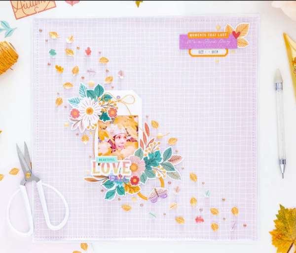
It really looks like the wind is sweeping leaves across the page on this Fall Love Layout from Celes. She framed her photo in a tag for the focal point, adding clusters of leaves, flowers and sentiments at two corners. She fussy cut lots of tiny leaves from pattern paper and added them across the design at a diagonal which adds so much movement to her design.
Take a closer look over at the Pinkfresh Studio blog.
-Heather
Looking for scrapbook supplies, we recommend A Cherry on Top.com



Leave a Reply