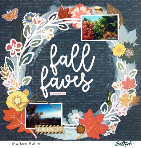
To help the die cut wreath on this Fall Layout really pop Majken painted a circle of light blue paint over the pattern paper. This is a simple way to help your focal point stand out against a darker background. She kept her design balanced by adding her photos on opposite corners of the page and tucked in a few extra flowers and leaves around the design.
Visit the JustNick blog for a closer look.
Looking for more digital papers? Check these out over at Design bundle
Are you looking for more Embellishments, papers, and supplies? Check out today’s crafting deals over at Amazon.com.
Looking for more ideas? Follow our Pinterest Boards.



Thank you for sharing!