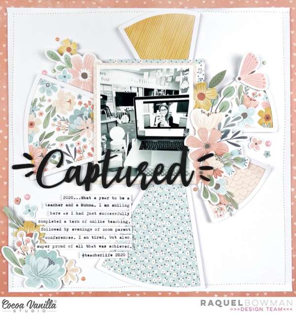
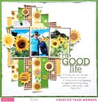
Kylie used a die cut shape that looks a bit like a pie chart or sunburst as the focal point of her layout adding the photo in the center. Each section of the die shape is backed by pattern paper and is surrounded by clusters of flowers. Having the photo, title and journaling in black and white really help them to pop against the pattern florals. She’s sharing more about this page along with another layout in a similar design over on the Cocoa Vanilla blog.
-Heather
Looking for more Digital papers? Check out Design bundle


Leave a Reply