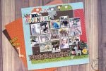
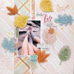
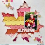
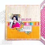
I love this different take on a grid design layout, instead of squares it uses rows of connected circles. This large die fills the entire page but leaves lots of spaces for photos, journaling and pattern papers. I love how a few of the flower embellishments are extending outside of their circles.
Visit the Jillibean Soup blog for a closer look.
-Heather


This is so creative and aesthetically pleasing! Very well done!