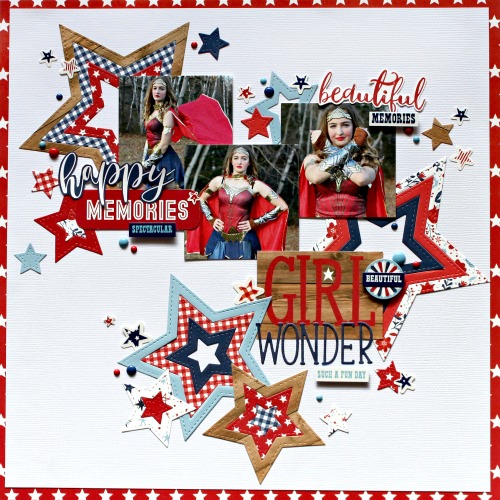
Lots of die cut stars in red, white and blue dominate this Girl Wonder Layout from Michelle. It’s the perfect design for a Halloween or Cosplay super hero scrapbook page. The die cut stars explode across the background adding lots … Read More ...
Spooky Spiderwebs Layout
I love the rustic look of this Halloween layout from Nathalie. She added several die cut spider webs over the woodgrain background for the perfect haunted house look. A scattering of bats and clusters of Jack O’ Lanterns add movement … Read More ...
Black Stripes Halloween Layout
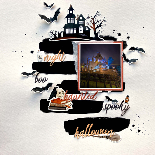
Lydia used black watercolor to apply wide dark strokes of paint across the background paper for this wonderfully Spooky Layout. In between the strips she added sentiments and scattered around lots of Halloween die cuts. I love how she folded … Read More ...
Fall Rainbow Layout
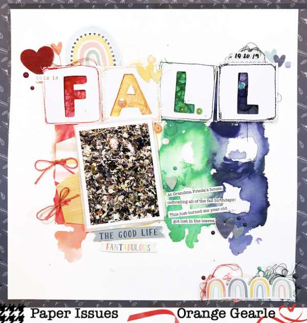
Who says you can’t have rainbows in the Fall? Orange Gearle used a trendy rainbow theme for this colorful Autumn Layout. I love the wash of watercolors in the background and how she cut the FALL letters from squares of … Read More ...
Colorful Halloween Layout
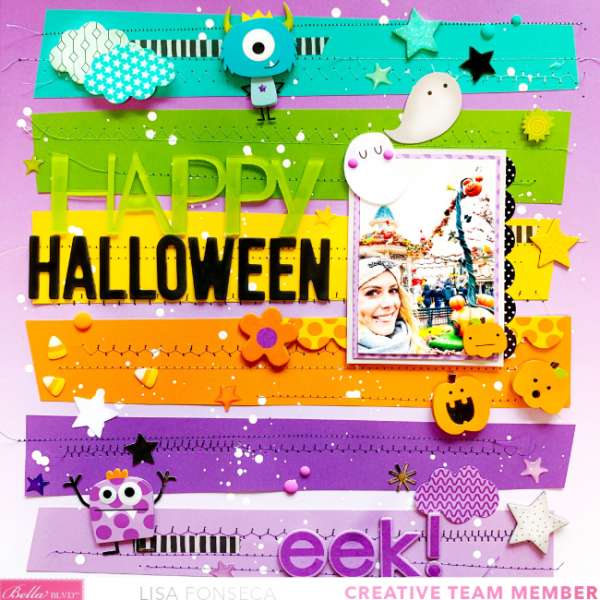
EEK! Lisa sewed down colorful strips of cardstock for the background on this cute Halloween layout. The scatter of fun little dimensional ghosts and goblins help draw your eye around and splatters of paint add texture to the page. I … Read More ...
Pumpkin Spice Layout
Hurray, it’s finally time for everything Pumpkin Spice! I love this flavor in coffee, doughnuts, you name it. And I guess Erica Thompson must too becuase she dedicated a scrapbook page to this wonderful fall flavor. She used a large … Read More ...
Fall Day Layout
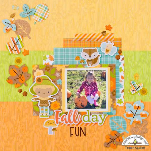
I love the color combo of orange and teal on this Fall Day layout from Tegan. The cute pattern papers and dies are from the new Pumpkin Spice collection from Doodlebug Designs. Such a great idea to die cut the … Read More ...
Happy Fall Layout
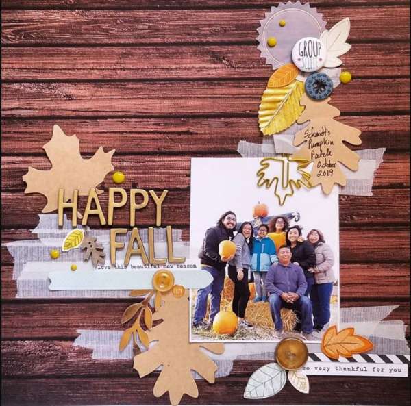
I love going to a farm to pick out our pumpkin each year, it’s a great backdrop for family photos. I love the touches of Gold and Kraft on Michelle Hernadez’s Happy Fall Layout featuring her family. The woodgrain paper … Read More ...
1 Alphabet 5 Ways
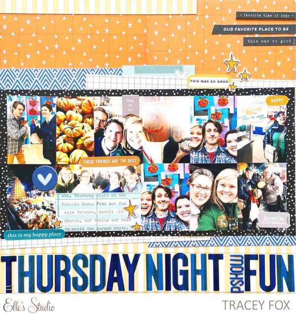
The design team over at Elle’s Studio were all given the same Navy Acetate Alphabet to use on their layouts. The results are 5 different layout ideas with themes like Food, Family and Halloween. I love the semi transparent look … Read More ...
First Job Layout
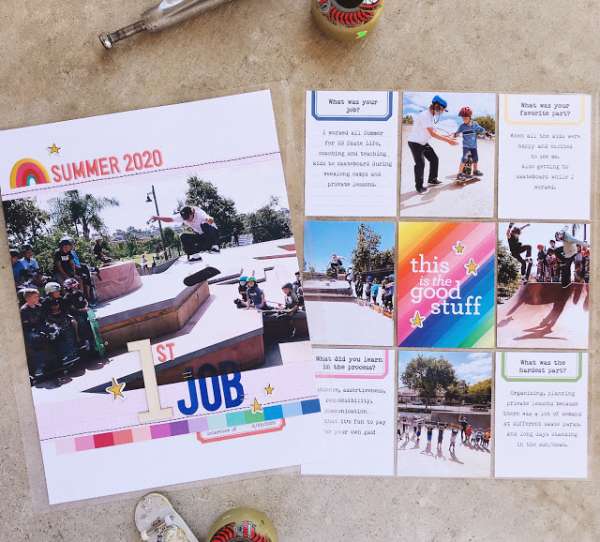
Nathalie created this double page layout about her sons first summer job at a skate park. One page is a large photo with the title, the opposite is a grid style pocket page with more photos and lots of journaling. … Read More ...
Fall Floral Layout
Who says Fall Layouts have to be orange, reds and browns? Flora use soft subtle colors and florals on this beautiful Fall page. The photo is the focal point in the center of her layout surrounded by a wreath of … Read More ...
Super Hero Layout
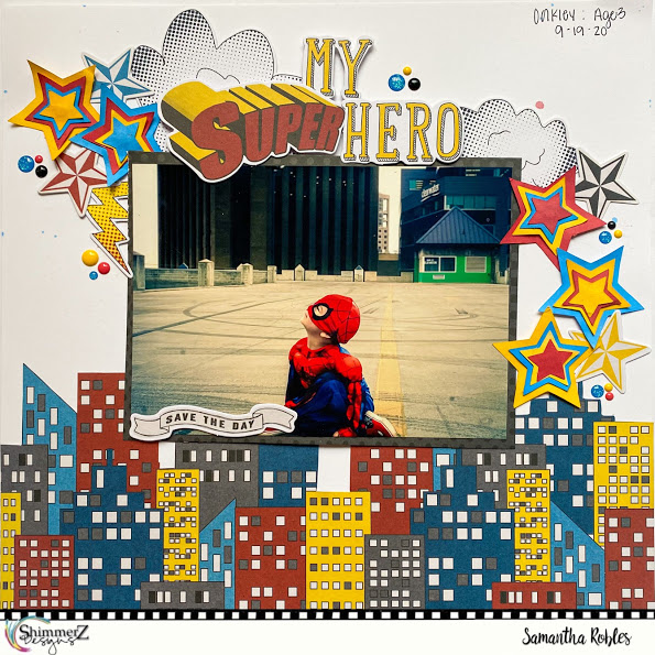
Able to leap a tall building in a single bound! Bright primary colors and graphic designs are perfect in this comic book style Super Hero Layout from Samantha. She used papers from Fancy Pants and die cut Star Shapes from … Read More ...
Dinner Party Cat Layouts
I love the tall skinny page style of the Life Crafted albums from Citrus Twist! The aren’t so big that they are intimating, you can finish a layout this size pretty quickly but they still have lots of room to … Read More ...
Double Page Halloween Layouts
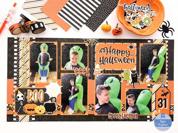
Kylie used lots of traditional orange and black papers and elements for this fun Halloween double page spread. The colors work perfectly with all the green that’s in the photos. Keeping her designs simple left her room for plenty of … Read More ...
Not So Magical Layout
Doesn’t it stink when something is just not as amazing as you had hoped? Tracey had that experience while dinning at Disney and deiced to scrap about it in this “More meh, than magical” layout. Don’t you just love the … Read More ...
