Monique stitched down strips of pattern papers to her background for a wonderful color block effect. A photo, Santa image and large die cut title is all that’s need to finish off this festive Holiday design. I think this is … Read More ...
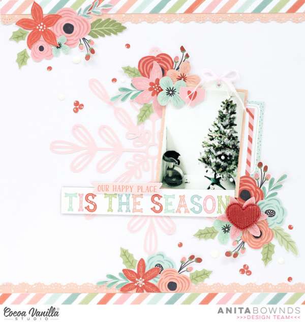
Tis the Season Layout
Who says you have to only use red and green for Christmas designs? I adore the use of pink and teal as an alternative to a more traditional color scheme in this layout from Anita Bownds! Her cute black and … Read More ...
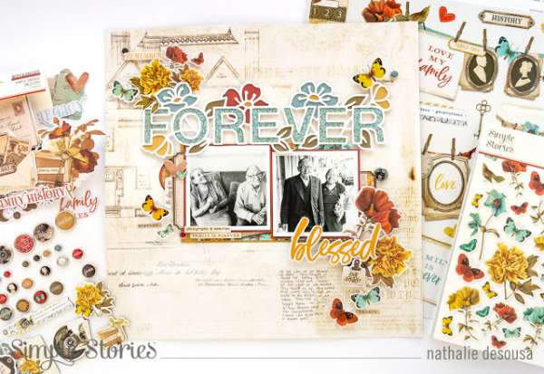
Family Heritage Layout
The Ancestry collection from Simple Stories is perfect for Family and Heritage scrapbook layouts. Nathalie used it for beautiful page with teal and orange accents working so well with the vintage look of the background and flowers. Her white die … Read More ...
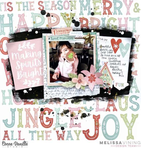
Making Spirits Bright Layout
I love the soft non-traditionally color combo on this sweet Making Spirits Bright Christmas layout from Melissa. She used supplies from Coca Vanilla using black paint across the background pattern paper to help her photo, journaling and title really stand … Read More ...
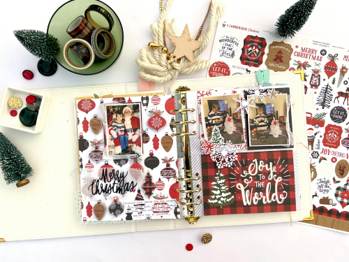
Smaller Christmas Layouts
Lydia creates a 6″ x 8″ album for Christmas each year, a smaller album is the perfect way to capture a single holiday or event in one place. She sharing two pages she made using products from Echo Park, one … Read More ...
Christmas Tree Layout
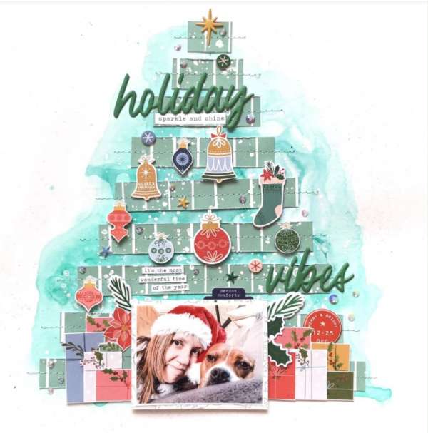
Vicki created her own Christmas Tree by sewing down graduating strips of green pattern paper. She decorated her tree with ornaments fussy cut from pattern paper and did the same for presents under the tree too, topping it off with … Read More ...
Puppy Love Layout
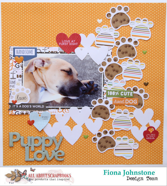
Fiona used cute paw print and heart die cut shapes all over this adorable Puppy Love layout. She added stripe and foot print papers to back the open die cut images for lots of coordinating pattern and also scattered around … Read More ...
December Christmas Layout
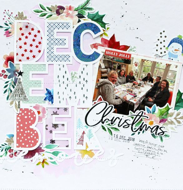
Monique used a large “December” open cut die for the title of this Christmas layout. I like the tall stacked lettering and how she backed each letter with different holiday pattern papers. Clusters of festive elements are tucked in behind … Read More ...
Sweet Fall Layout
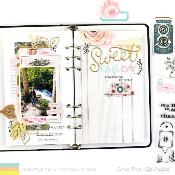
I love that Marsha used non-traditional colors for this beautiful Fall Layout. Inspired by a sketch from Citrus Twist Kits she used layers of pastel papers accented with gold leaves tucked under the photo, keeping the opposite page simple with … Read More ...
Fall Backyard Fire Layout
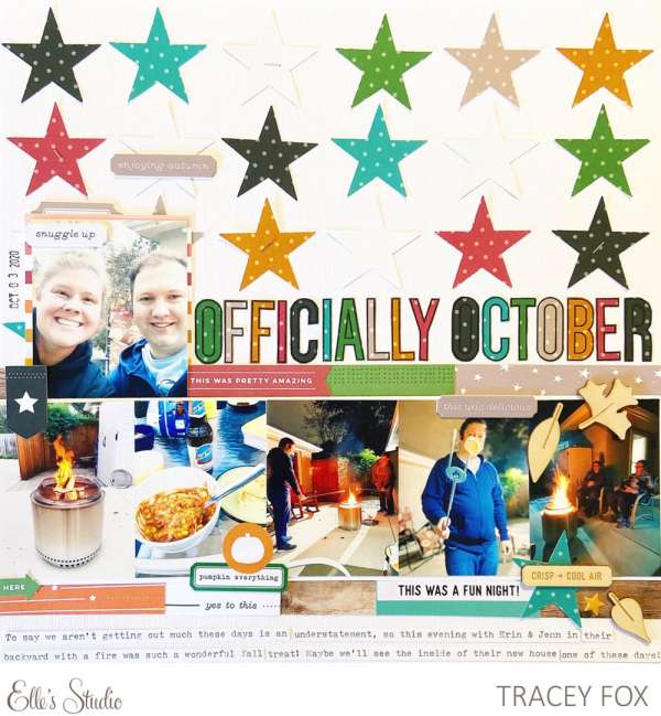
Tracy used polka dot pattern papers to punch out her star designs and stamp out her page title for this Fall Backyard Fire layout. A row of photos across the bottom echo’s the row of stars across the top and … Read More ...
Family Heritage Layout
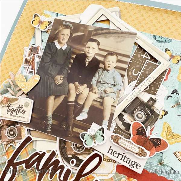
Kyle used a wonderful vintage family photo for this Family Heritage Layout. The muted color combo of pale teal and orange work well for a vintage design, cameras and photo frame reminiscent of times gone by add to the old … Read More ...
Library Layout
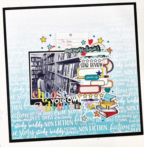
I am thankful to be able to read books electronically but I so miss being able to take my time and peruse though all the books in my local library! This wonderful Library Layout from Khristina focuses on a large … Read More ...
Cozy Fall Days Layout
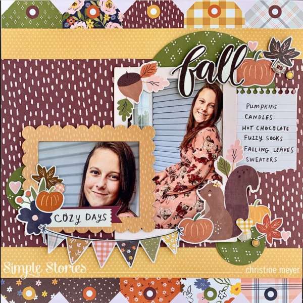
Christine Myer used products from Simple Stories for this Fall Cozy Days Layout. She used a mix of different warm colored pattern papers and clusters of die cut accents around the photos. The tops of tags across the top and … Read More ...
Mushroom Layout
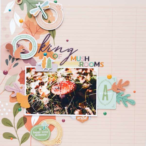
I’m not really sure why I like mushrooms so much, not only to eat but also to design with. I have more mushroom stamps than any one crafter probably needs 🙂 They work so well as an element for fall, … Read More ...
Too Cute to Spook Page
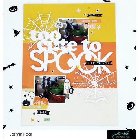
I love how Jasmin used wide stripes of yellow, orange and white to mimic candy corn on the background of this cute Halloween layout. She die cut large spider webs and the “too cute to spook” title from white cardstock … Read More ...

