The green papers and embellishments on this First Birthday page from Anya go perfectly the with lovely green grass and trees in the outdoor photos she used. I love how she used a large number 1 in the center to … Read More ...
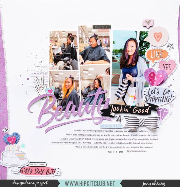
A Day of Beauty Page
Jung Ahsang scrapbooked a day of beauty for her daughter with this pretty page, getting her hair colored, going shopping and having a fun girls day out. The cool elements on the right side help balance out her photos on … Read More ...
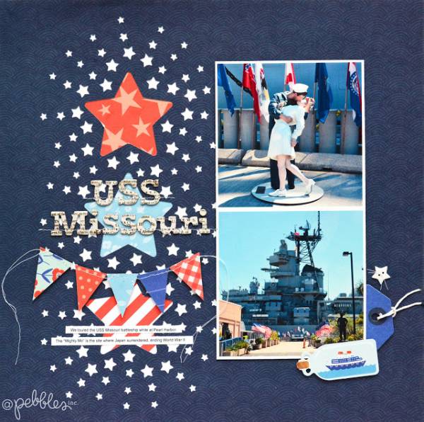
Patriotic Layout
Using lots of red white and blue pattern papers Marcia created her own patriotic embellishments for this USS Missouri layout. The little ship in a bottle embellishment is the perfect finishing touch. Stars and pendants are always great accents for … Read More ...
Vintage Journal Page
I love the vintage feel of this mixed media Journal page from Emma. The burlap and the dark staining help bring an old timey feel but the flowers and lace bring a soft feminine touch.
Take a closer look and … Read More ...
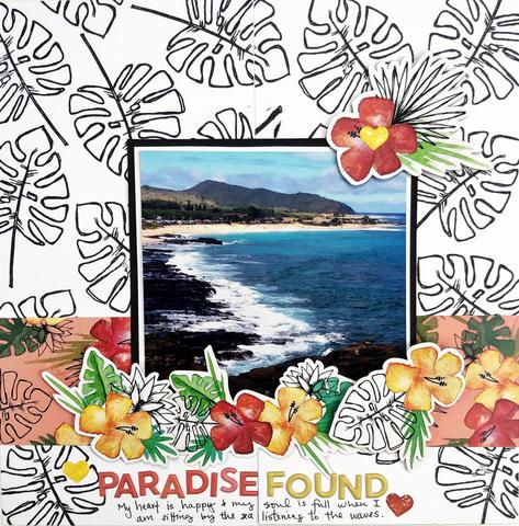
Double Traveler’s Notebook Layout
I love how Khristina used two side by side pages in her Traveler’s Notebook to create one large layout. She used a large tropical leaf stamp in black for her all over background pattern adding colorful pattern paper and dies … Read More ...
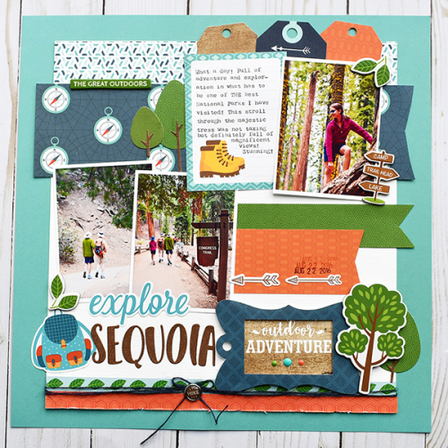
Outdoor Hiking Page
Suzanna created this fun Summer Hiking Layout with lots of pattern papers and embellishments from Echo Park. All the trees, signs and compass are perfect for an outdoor adventure page!
Visit the Echo Park blog for a closer look at … Read More ...
Fussy Cut Floral Page
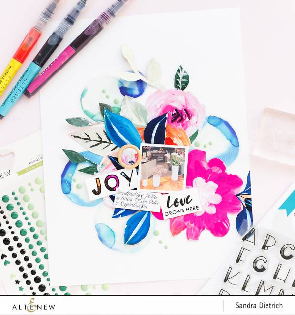
Sandra fussy cut large flowers from some pattern paper from Altenew to fill this pretty scrapbook page. I love how she used staples to adhere her paper, it adds a hard look to balance the soft florals. She also used … Read More ...
Scalloped Swimming Page
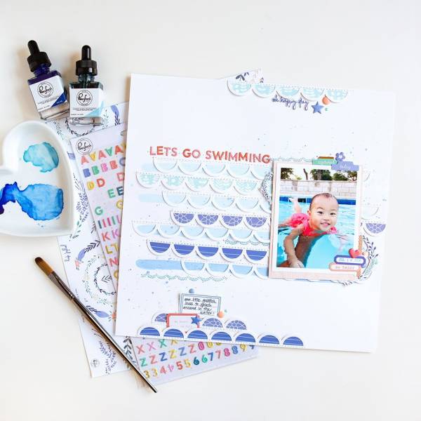
Blue pattern papers and washes of watercolor behind the rows of scallops on this layout from Jung are a clever way to represent waves on her swimming layout. I love how she stitched the scallops and title down to her … Read More ...
Sand and Sea Page
The layers and dimension on this Sand and Sea layout from Juliya are amazing! I love the lighthouse off to the side and how to circle draws you into the center and it reminds me of looking through a porthole … Read More ...
Stamped Planner Border
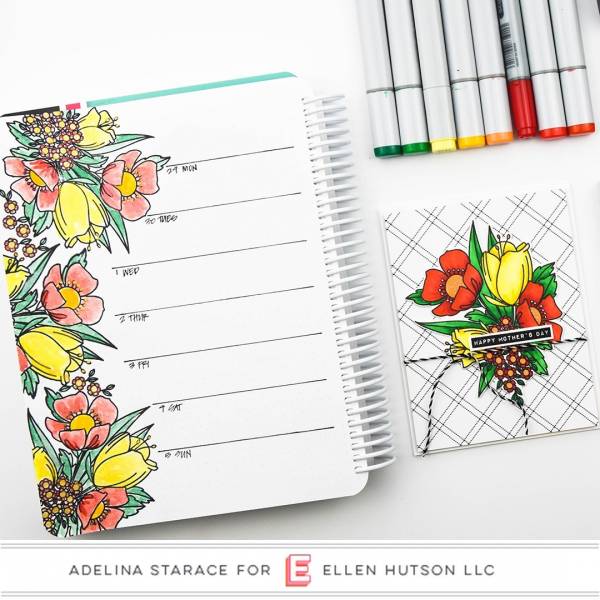
Adelina used pretty floral stamps from Ellen Hutson colored with watercolors to create this beautiful border in her planner. I like how she added her own day of the week lines with just a pen and ruler.
Grid Page with 6 Photos
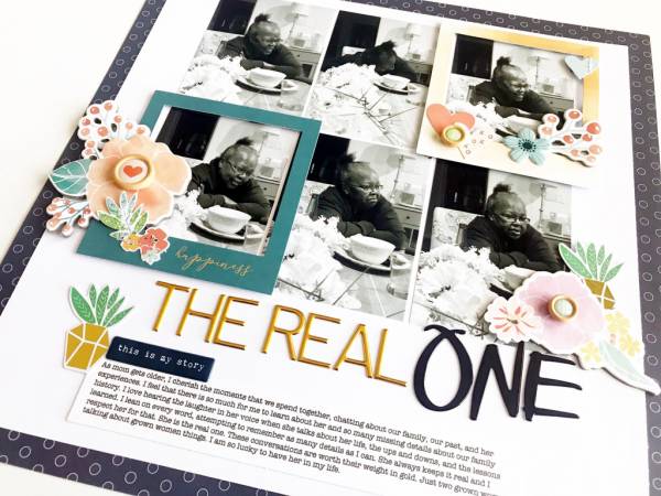
Victoria Marie was able to get 6 photos on one scrapbook page by using a grid layout. I love how she drew focus to two of the photos by adding a colorful frame around them and how she mixed black … Read More ...
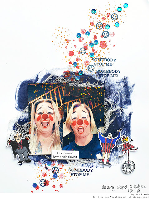
Clowning Around Page
Sue used some silly Snapchat photos of her and her sister with clown faces for this fun and funky circus themed scrapbook layout. I love the scattering of sequins and smiley faces and the cool clown stamps from Viva Las … Read More ...
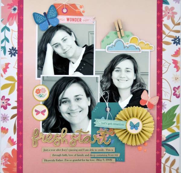
Scrapbook Layout with 3 Photos
The trend for awhile in scrapbooking has changes from having lots of photos on a page to only having 1 or maybe two. But I agree with Jenn Gallacher that I like to try to include a few photos on … Read More ...
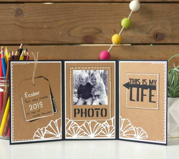
Tri-Fold Photo Card
This sweet little Tri-Fold Photo Card makes a perfect keepsake gift or something nice to sit on your desk. Els is sharing how she used cardstock and dies to create it. I love the faux stitching she added with a … Read More ...
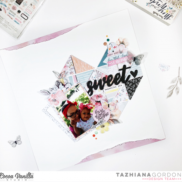
Pattern Paper Mosaic Page
I love how Tazhiana used triangles cut from different pattern papers to create her lovely mosaic design on this scrapbook page. The bold black title really stands out from the soft pastel papers and the subtle tearing at top and … Read More ...

