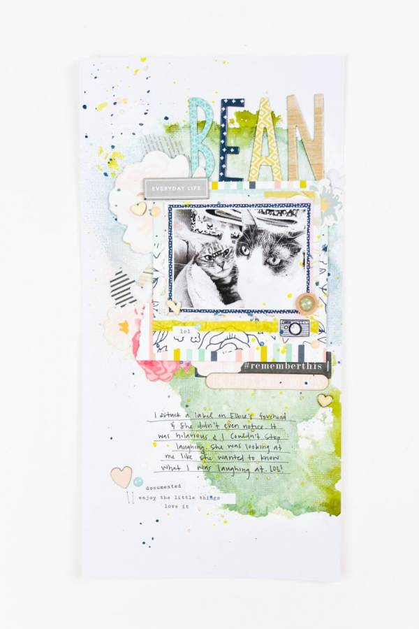
The watercolor wash and splatters with loads of patterned papers adds some great layers and texture on this funny layout from Suzanna featuring her cats. I love how each letter in the title is a different color that matches the … Read More ...
Farm Scrapbook Layout
Lydia created this cute farm pocket page with products from Bella Blvd. The layout of 4 large pocket pages gives enough room for two 4×6 photos, a large area for journaling and another space for a cute farm scene.
Take … Read More ...
Wreaths Layout with Mini Album
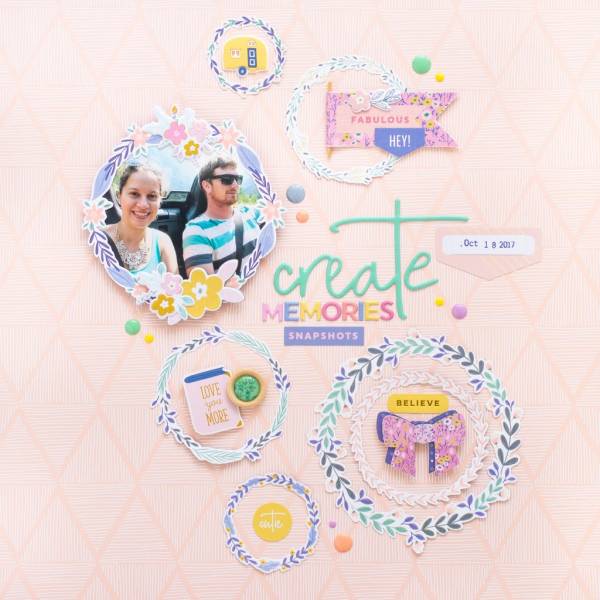
The pretty wreaths scattered around on this page from Flora are the perfect focal to draw your eye to the photo, phrases and embellishments. She used products Pinkfresh Studio for her layout and also used them to create a matching … Read More ...
Buttons and Dragon Scrapbook Layout
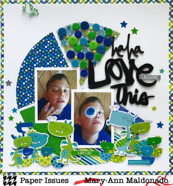
Mary-Ann grabbed her stash of buttons to create this super fun boy layout, don’t we all have a really big bunch hidden away someplace, I know I sure do! And I love the “pie chart graph” shape she used for … Read More ...
2 Rainbow Inspired Layouts
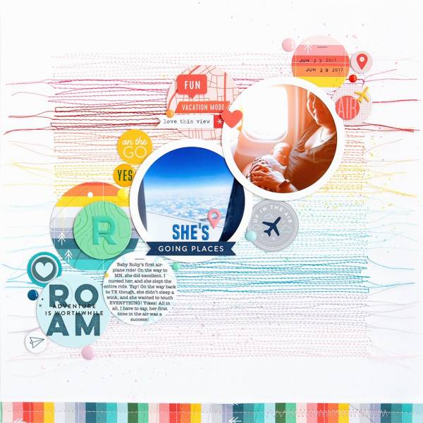
These two amazing layouts from Jung were inspired by rainbows. The rainbow colored stitching on this fist page is amazing and I love the raw hanging thread ends. The second page has lots of tag shapes in rainbow colors keeping … Read More ...
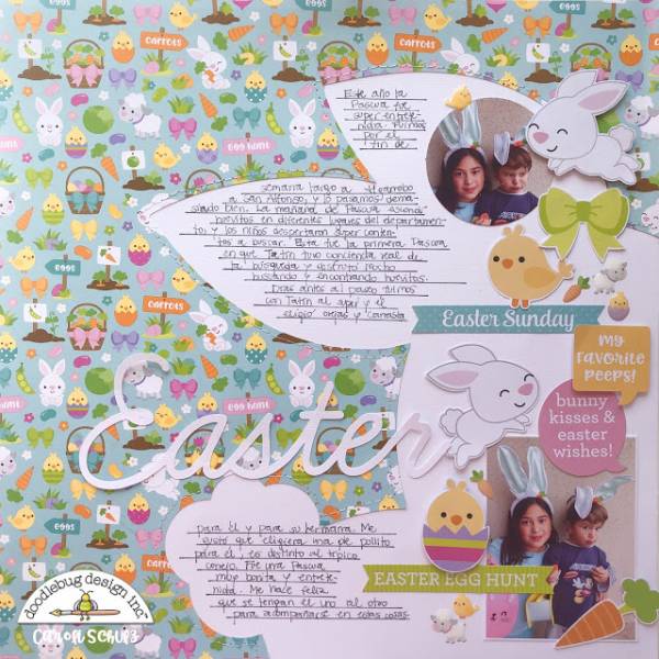
Easter Bunny Silhouette Layout
Caroli used cute Easter pattern paper on her layout with the silhouette of a large white bunny off to the side of her page as the perfect area to add her journaling, photos and embellishments. It’s a cute way for … Read More ...
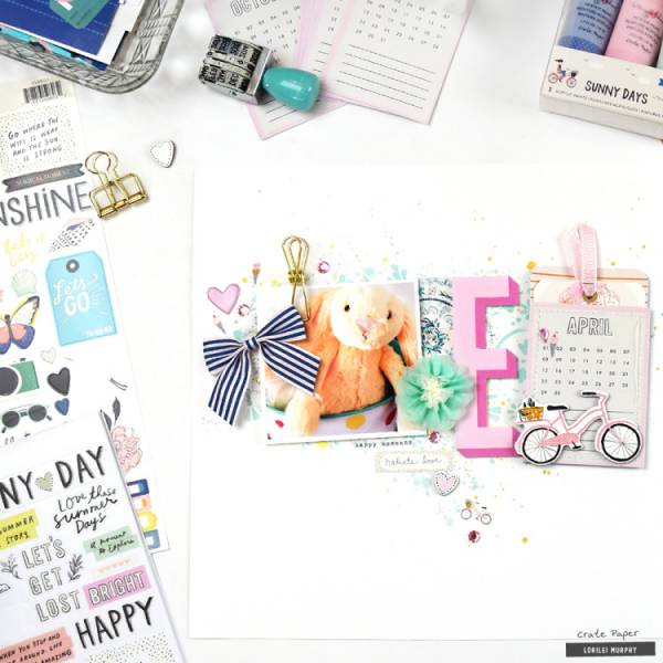
Easter Layout
Lorilei kept her stencilled background, photos and embellishments all across the center of her Easter layout, which it makes for very clean and modern look. The calendar month is a pocket that holds some sweet tags and the metal clip, … Read More ...
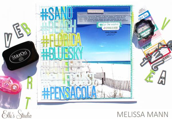
Hashtag Beach Layout
Melissa Mann used lots of great hashtag phrases for the title down the side of her beautiful beach scrapbook layout. She stitched down her stamped and die cut letter in colors that perfectly match her large photo.
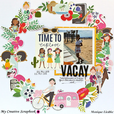
Vacation Wreath Layout
I love how Monica used all her images in a large circle on her page to create a fun wreath shape. This idea would work for just about any occasion. She’s got directions for how she laid her scrapbook page … Read More ...
Climbing Scrapbook Page
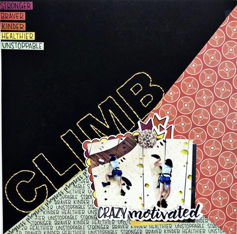
The angle and the bright stitching on dark cardstock makes the title of this “Climb” scrapbook page really stand out. Khristina used products from Wild Whisper Designs and is sharing it on their blog.
Club or Team Members Layout
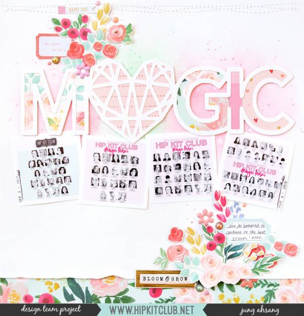
This layout from Jung Ahsang celebrates her fellow design team members over at the Hit Kit Club. This is a great way to scrap members of any team, club or group you belong to. I love the trendy ink blended … Read More ...
Tips for Pocket Scrapbook Pages
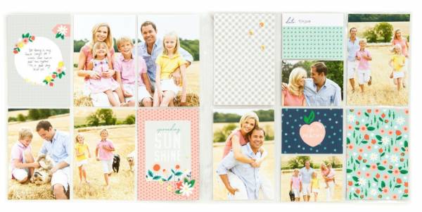
The Close to My Heart blog has some helpful tips for pocket scrapbook layouts. Stick with a color scheme to keep it cohesive, pick a single event or story and plan out your pattern. There’s even some template for page … Read More ...
3 Tips to Correct Photos
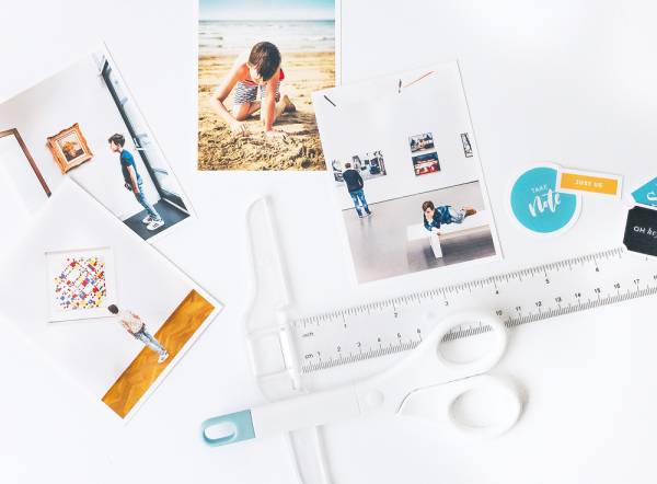
Do you have some photos that just aren’t looking as good as you hoped they would when you snapped them? Elif has 3 helpful tips on how to digitally adjust them to fix underexposure, remove unwanted items and changing perspective.… Read More ...
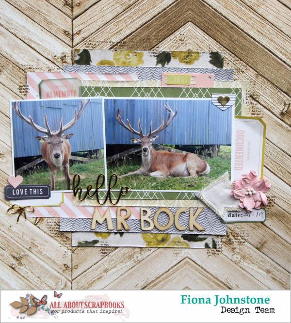
Rustic Deer Layout with a Pink Twist
I love the mix of pinks, florals and rustic wood designs on this layout. Fiona Johnstone used products from the Emmerson Lane line from Heidi Swapp. The combination works perfect with the sweet photos of the deer.
Minimalistic Layout
Sometimes you don’t needs loads of layers, tons of text or piles of embellishments on a page. Keep it simple like did Marcy with just a photo and a tag. Clean and minimal can be a nice break from busy … Read More ...
