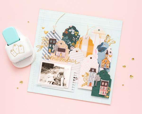
 I love a repeated look, using the same shape or design again and again is an easy way to fill a large space on your layouts. This beautiful layout uses a tag shaped punch (that conveniently has 3 sizes … Read More ...
Themes, layouts and inspirations
 I love a repeated look, using the same shape or design again and again is an easy way to fill a large space on your layouts. This beautiful layout uses a tag shaped punch (that conveniently has 3 sizes … Read More ...
One simple way to add pattern and texture to your layouts is with paper tearing. Christine used a mixed of orange and green plaid and gingham pattern papers, tearing each one and layering them up for a beautiful background on … Read More ...
Memory Planner Pages are sort of a mash up of planners and scrapbooking. It’s a simple way to document day to day life, scrapbook, stay organized and journal all in one place. These pages from Marsha are in a planner … Read More ...
Erica used lots of open die cut words and shapes for this fun Back to School Page. She cut each one from white cardstock and filled in the sections with lots of different pattern papers, this is a great way … Read More ...
This beautiful layout from Melissa looks like photo frames hanging on a wood paneled wall. Across the top of the her page she has a border of two torn and sewn pattern papers and then stitching coming down in three … Read More ...
As with everything styles come and go and looking back on older scrapbooking layouts you’ve created in the past they may look very dated or maybe the pages themselves are falling apart and haven’t held up well or you’re running … Read More ...
This layout from Yarleys is a great reminder we should always be scrapbooking about ourselves and not just those around us. For this wonderful page she started by painting her background in rainbow colors and then adding a large graphic … Read More ...
Wow, isn’t his Butterfly layout from Jennifer stunning?! She cut a large butterfly shape from white cardstock, stitching around half and then fussy cut lots and lots of butterflies from pattern paper to fill the other half of the shape … Read More ...
Emilie is ready for Halloween with this wonderful Pumpkin Layout. She added lots of texture by adding torn double sided pattern paper down one side of the layout and also behind her photo. She added her embellishments mostly across the … Read More ...
The pattern paper background that Zsoka used on this page has a wonderful doily print that she incorporated perfectly into her design. My favorite aspect is her journaling, she wrote it around the outside scalloped of the doily all the … Read More ...
This Mermaid Vibes layout from Khristina has so much great texture and pattern! She heat embossed starfish over top of the pattern paper background, adhered her photos and journaling cards with pattern washi tape and even added netting with tiny … Read More ...
I love the rainbow of colors in this Fruit Layout from Amy that features photos of her plum tree. She added splashes of watercolor in different colors down the center of her background, adding embellishments of fruits and butterflies in … Read More ...
An easy way to add interest to a scrapbook layout is the add your photos and elements on the diagonal. Misty painted a colorful wave from one corner to the opposite bottom corner for the background of her Covid Birthday … Read More ...
When you’re stuck for ideas try “scraplifting”, taking a page layout from someone else and using what you have to create a similar design or style, like you would a sketch. Joy used a baby layout to inspire her Dark … Read More ...
Close to My Heart had some amazing products that are perfect for Disney themed scrapbook pages, cards, party invites and more. They are offering scrapbook and card making workshops guides online with step by step directions for making terrific layouts … Read More ...