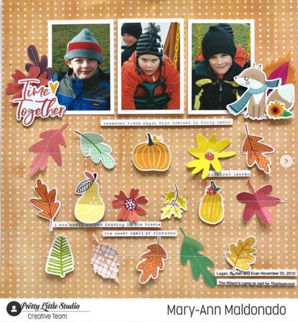
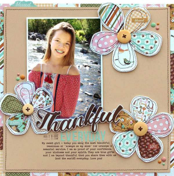
Mary-Ann sewed rows of die cut elements towards the bottom of this cute Fall layout for a fun grid design. By only adhering them with a simple row of sewing helps them pop of the page and add depth. The … Read More ...
Large Title Halloween Page
Heather Conklin use a fun “Halloween” word die from Silhouette as the main focus of her layout, using it to fill up almost the entire page. She filled each section of the die with different fall pattern papers for added … Read More ...
Autumn Leaves Layout
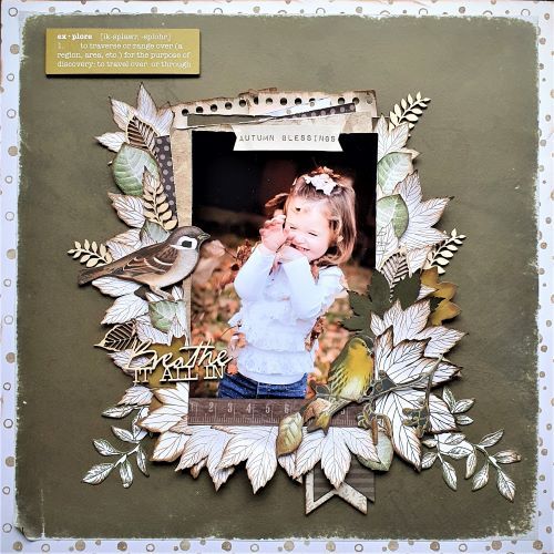
Michelle added lots and lots of fussy cut leaves to her lovely layout, their lighter color really pops over the dark background. They perfectly frame the sweet photo in the center and I love the little bird elements and title … Read More ...
20 Tips for Pocket Pages
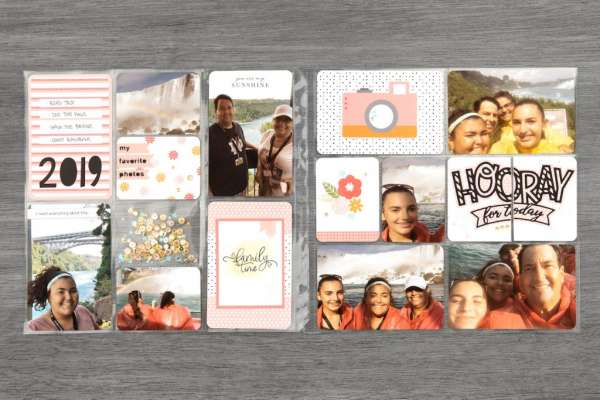
Pocket pages are quick and easy ways to put together a fast scrapbook layout. But you don’t want them to all start to look that same so Close to My Heart is here to give you 20 helpful tips for … Read More ...
Vintage Looking Photo Album
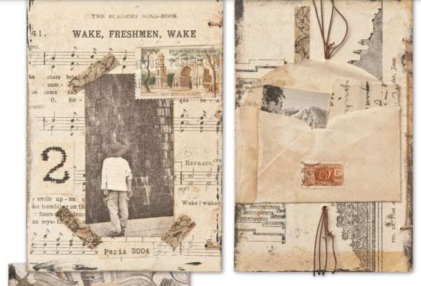
Sharon Payne Bolton created an amazing album using new photos but made it appear as if it was an old family heirloom. Printing her new photos in black and white or sepia tones gave them an aged look and using … Read More ...
Back to School Layout
I love the all over pattern on this layout! Traci used an adorable all over school design pattern paper from Doodlebug for the base of this cute Back to School Layout. Over top she added a large white circle, placed … Read More ...
How to Add Color Pattern Papers
Monique wanted to add some color to some lovely black and white floral papers for her layout so she use Distress Ink Pads and a little water to add a pretty wash of pink color. She then fussy cut out … Read More ...
Textured Fall Layout
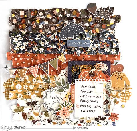
Wow, check out all the amazing texture on this Fall Layout from Jennifer McMurtrey! She cut thin strips of different autumn colored pattern papers and then simple wadded them up and scrunch them to distress them, then smoothed them out … Read More ...
Lucky Mixed Media Layout
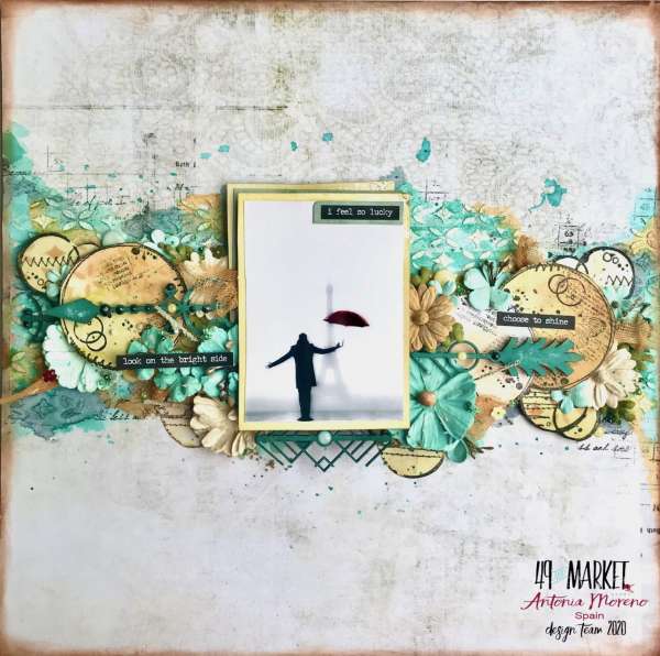
How amazing is this Mixed Media layout from Antonia!? She concentrated all her design elements in a border across the center of her page. Add depth and texture from stenciling, layering and clustering stamped circles, wooden embellishments, 3D flowers and … Read More ...
Chevron Layout
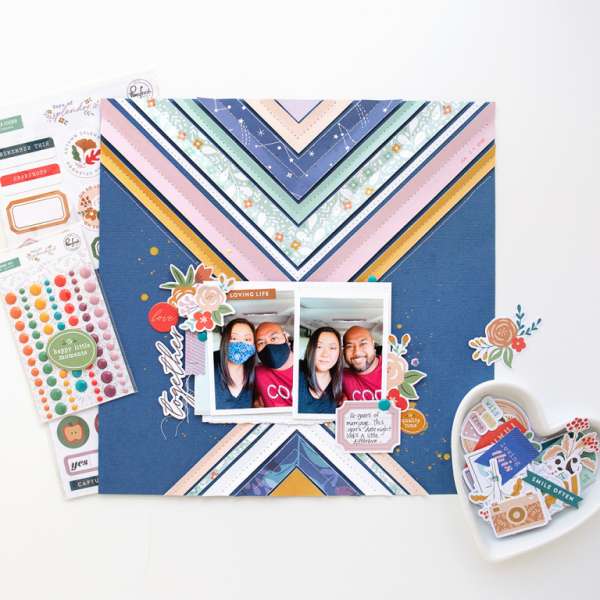
Jung Ahsang created her own amazing large chevron pattern for this layout. She cut each section from pattern papers, distressed the edges and then sewed them onto her page down the center of each one. The points of the chevrons … Read More ...
A Girl and Her Dog Layout
I love the use of grays and a soft teal blue on this beautiful layout from Tracy. The graphic floral prints and mostly monochromatic color scheme works perfectly around the black and white photo of a girl and her dog.… Read More ...
Tea Traveler’s Notebook Layout
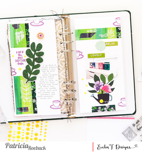
To many drinking tea is an important part of their day, either having a cuppa waking up, caffeine helping you get through the day or unwinding at night. Patrica devoted a double page layout in her Traveler’s Notebook to her … Read More ...
Masculine & Feminine Layouts w/ Same Papers
Lisa Dickinson has some great tips for getting more from your pattern papers. She used the same paper to create both a masculine page and a feminine page. By using the paper to create different design elements like flowers and … Read More ...
Texture Paste Techniques with Vicki Boutin
Do you love texture paste, stencils, and endless advice from the one and only Vicki Boutin? Then this is the mixed media mini-class for you! Join blogger, designer, and incredibly ingenious instructor Vicki for 3 easy yet eye-catching techniques … Read More ...
Floral Wreaths Pet Layout
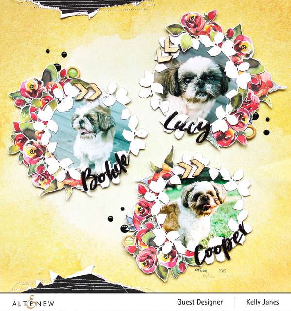
Kelly Janes used die cut wreath shapes adding fussy cut flowers from pattern paper to create three lovely flower wreaths to encircle photos of her beloved dogs. Torn paper, stitching, wood shapes and enamel dots help add depth and texture … Read More ...
