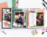
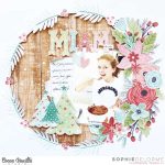
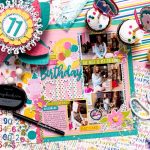
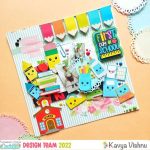
To celebrate the launch of their new line Vintedge, Ruby Rockit is having a blog party this week. They are also giving one lucky winner the entire collection! Click here for all the details.
Trackbacks
Have you read?
12 Fall Scrapbook Layout Ideas for Children and Babies
Brianna used textured cardstock and torn pattern papers at an angle for the background of her darling design. There’s lots of Fall images in clusters, notebook paper for the journaling and pattern title. Find more details at the Doodlebug Blog.
As a child Fall was one of my favorite times of year to be outside. Jumping in piles of leaves, taking a stroll and crunching fallen acorns, riding my bike a few last times before it get’s too cold and trips to pick apples and Autumn produce. It’s a wonderful time to get the kids out and take some fabulous Fall photos. Today we’re taking a look at scrapbook layout ideas for babies and children with Fall themes.
Below each photo you’ll find a link, click it for details like process video, techniques and products used.
Helen used a large open die cut for the title of her sweet page. She’s backed it and the pumpkin dies with orange, brown and blue pattern papers for a great color combo. There’s also lots of die cut leaves, and a pumpkin wax seal. Find a link to her process video at the Hey, Little Magpie blog.
This stunning layout from Michelle Lee has soft and subtle shades of greens and browns with a vintage feel from film strips, dried looking leaves, stacks of frames and tabs, netting and aged looking background paper. Take a closer look at the 49th and Market blog.
Here’s a adorable Autumn layout from Monique with bold and bright colors and patterns. She used a pumpkin die and backed it with plaid pattern papers and also applied gesso and watercolor over top of the her background pattern paper. There’s also a cute title made from foam letter stickers. Hop over to the Paige Taylor Evans blog for more info.
This layout focuses on the coziness of Fall with lots of stitching, a sweater image, fun Autumn phrases, torn sweater pattern paper and thin stitched leaf pattern borders. I spotted this cozy kid layout at the Echo Park Instagram page.
This sweet design has loads of Autumn patterns in a grid with washi tape, a tag with twine and cute chipboard squirrel. Notice how some of the tiny sentiments and embellishments are stapled down for added interest too. Visit The Cherry on Top blog for more info.
This totally adorable layout reminds me of a nature journal with the black on rust botanical paper background and die cut flowers and leaves. There’s a cute floral bouquet in a pair of hiking boots and touches of gold all around as well. Take a closer peek at the Spellbinders blog.
This amazing Autumn layout from Erika has so much texture, depth and pattern! She staggered three large blocks of pattern paper, stitching around the edges of each, behind the photo is acetate printed with words, there’s clusters of Fall chipboard shapes, strips of journaling and a fun title. Find more info at the Bella Blvd blog.
This gorgeous grid design from Karyn has a large scalloped circle with photos in the center but all together they’ve been cut into squares and slightly separated to show the golden paper behind. There’s also a leaf border and an oval for journaling. Watch her process video on the Karyn Crops blog.
Allison started with a sketch as inspiration for her layout that features one large photo. Two corners of the photo are covers by stitched strips of pattern papers at an angle. There’s also large clusters of flowers and leaves in two corners to contrast the woodgrain background. Learn more at the Allison Davis 4 GS blog.
This charming layout from Jessica uses a large leaf die cut from black and backed with plaid paper as a focal behind the photo. There’s also fussy cut flowers and leaves, chipboard title and lots of mixed media fun on the background with watercolor, splatter and lots of small gems. I came across her idea on her Jessica E Michaels Instagram page
This little guy is having a blast wandering around the Fall forest. Julie used torn paper, an acrylic title, wooden shapes, vellum shapes, staples and more to add loads of texture to her design. Take a closer look over at the Bramble Fox blog.
I hope you and your kids are able to get out and enjoy some Fall weather and take lots of fun pictures to scrapbook!
-Heather
You can shop some of our affiliate companies mentioned in this post:
[…] Blog Party & Giveaway – 1 freebie(s)? […]